 Facebook
 X
X
 Instagram
 TikTok
 Youtube

Title: Threshold
Address: blog.studioearchite…
Author: John Sheehan et al.
From: Bankers Hill
Blogging since: Sept. 2010
Post Title: Small is the New Black, Part 2
Post Date: April 23, 2013
Dogs that fit in your purse, urban parklets, and iPad minis…
As we noted last week, small is back in vogue in a big way — and it’s even extending to the spaces we call home. As the U.S. population becomes increasingly urban, the inventory of conventional housing types is straining to keep pace with increased demand. Micro-flats — rental dwelling units that are 300 square feet or less in floor area — are quickly currying favor among the leaders of major U.S. cities as a potential solution to this dilemma. Here are five more tips gleaned from our 25 years of designing compact, affordable units for anyone considering micro-flats.
Flooring and finish choices are critical in a small space. Reflective, polished, and light colored surfaces help to bounce daylight around and expand the space. Choose a single, high-quality flooring to run through the entire floor plan — breaking a tiny space into different zones (e.g. carpeted vs. tiled) only succeeds in making the room feel smaller. Kitchen, bath, and other built-in cabinetry should be of a single, simple, and clean design. The fewer things that the eye is arrested by in a space (exposed hinges, face detailing, pulls…) the more “open” and airy that space will seem.
11 feet wide (although 12 is better) and at least nine-foot ceilings — these are numbers that resonate with real-world living and real-world development proformas. Ignoring these can make your crib feel more like a coffin.
On the subject of beds: Murphys are cool (and quite expensive); twins are for college dorms… The fact is that most adults in the U.S. own a queen-size mattress. Plan for it. Floor plans that rely on convertible sofas or sleeping lofts don’t acknowledge the reality of the statistics.
The population that is inclined to rent (or buy) a micro-flat is the same one likely to own a slick bike. A spot to hang a bike inside the micro-flat is a great amenity, provided at little expense.
As architects, we are seldom asked to design furnished units — however, one idea we keep promoting is that of an oversized armoire on casters. I lived in a loft in Boston the first year I was married, and every unit was provided with two large painted particleboard “movable” closets. By pushing and shoving these beasts around on the carpeted floor, one could divide the loft up into two zones (sleeping and living/dining in our case) or push them against the walls to make one larger space. This would have been a lot easier had the closets been on casters.
Post Title: Micro-Flats: an Old Idea Whose Time Has Come...Again
Post Date: May 29, 2013
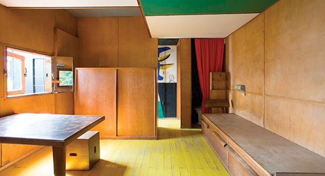
Architects have been noodling on the virtues of compact living quarters for a good long time. I recalled an example recently: Le Courbusier’s famous Cabanon.
The only house Le Corbusier ever designed for himself and his wife, Le Cabanon is perched atop a cliff overlooking the Mediterranean in the remote town of Roquebrune-Cap-Martin. This diminutive dwelling would feel right at home on our own Southern California seaside bluffs. At a mere 144 square feet, this pushes micro to the extreme — it’s really just a glorified and more-permanent version of a tent. In the hands of this master, however, every square centimeter was carefully conceived — nothing wasted, everything optimized.
Taking inspiration from steamship cabins, Le Corbusier organized his quarters around a collection of well-crafted built-ins: a table/desk, bookcases, two beds, a wardrobe, a sink, and a toilet tucked into one corner of the room.
[Post edited for length]
Comments