 Facebook
 X
X
 Instagram
 TikTok
 Youtube

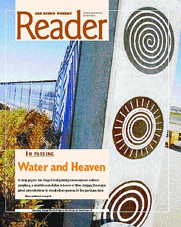
To help pay for San Diego’s first publicly commissioned outdoor sculpture, a small bronze statue in honor of Ellen Scripps, the mayor asked schoolchildren to donate their pennies to the purchase fund. Now, 80 years later, the visual and performing arts in San Diego have a $10 million budget administered by the city’s Commission for Arts and Culture, and public funding of private tributes is rare. In place of this, the commission favors insinuating art into civic construction projects — fire stations, street medians, libraries, wastewater-treatment plants, parks, pump stations, roadside retaining walls — by dedicating a percentage of the building cost to art. They also provide matching funds for town councils with art plans for their neighborhoods.
With several projects in the works at any one time, it’s difficult to pinpoint San Diego’s newest public art. But one recent example is the second Dairy Mart Road bridge across the Tijuana Estuary, near the water-reclamation plant in San Ysidro. The design commission was awarded to local sculptor Ellen Phillips. (Robin Brailsford was the artist for the first Dairy Mart bridge, farther to the west.) From the outset, Phillips worked with the contractor’s civil and structural engineers to influence the overall design.
Not everyone was pleased to have an artist around, according to Phillips. It took some time to establish — sometimes demand — a bit of give-and-take with engineers used to wrestling with practicalities and project budgets and deadlines. They were anticipating a standard, fast-and-serviceable narrow slab bridge with perhaps some decoration added by the artist. But as Phillips saw it, “The bridge had to fit the site, the valley. It had to be wide and low, because the landscape around it is low. And as I saw the project, it was all about water, so we needed to tie it to the water and the land.”
In one of her first meetings with the engineers and project managers, she asked them to draw a line or shape that to them was a symbol for “water.” Eventually, one of them ventured a sinuous line of gentle curves. The line was prodded and manipulated to fit the laws of physics and the demands of art, yielding a basic design that is commonly known to engineers as a haunched bridge. Some of Phillips’s wish list fell to construction codes or budget constraints, but in the end, she says, the collaboration of artist and engineer produced a beautiful bridge that is linked to the site and invites people to sit and enjoy the environment. The decorative work on the bridge is actually assembled from standard railing and fencing used in any road project.
Approaching the Dairy Mart bridge from the north, the sky-blue fencing is hardly noticeable beyond the trees. The landscape opens out at the riverbed, with scattered orange poppies and small yellow sunflowers. To the east is farmland in large squares of intense green; to the west is the estuary’s dark gray-green marsh scrub. The hills of Tijuana to the south spill pink and blue houses down to the rusty border fence.
At each end of the west side of the 1000-foot bridge are decorative blue fences, each comprising four connected panels about 7 feet high. The body of each panel contains wide-spaced diagonal bars arranged to produce a chevron effect. Each panel is topped with a running wave pattern and an arc enclosing a series of sunlike symbols. Between the two sets of panels is a swath of 1H-inch chain-link fence that runs along a 6-foot-wide pedestrian walkway. At four intervals the chain-link is interrupted by semicircular viewpoints with curved benches. All the metalwork on the bridge is the same shade of clear blue.
To select just the right shade, the artist spent many hours at the bridge site with color chips and swatches, examining them in the local light and against the landscape. According to Phillips, she saw the bridge as an arc between the water and heaven, between the sky and the estuary. She wanted a color that would enhance that connection.
Because “public art has to tie to the site,” in Phillips’s opinion, she researched the history of the area and assembled text descriptions and photographs of the famous flood of 1916 that washed away area homes and farms. These are reproduced, along with topographic maps of the watershed area, in etched black granite panels embedded into the benches. They are bordered with symbols from meteorology and ancient and modern languages that stand for rain, floods, and water. “The bridge was finished a year and a half ago,” says Phillips. “But these panels to complete the project were only installed a few months ago. Sometimes the finishing details get lost in the system once the basic work is done.”
If the city’s paradigm for encouraging public art is unlikely to produce a remarkable work of fine art, it does place art at some surprising public sites. And as Phillips says, it helps to subtly educate people about how color, design, and imagination enhance public life.
Comments