 Facebook
 X
X
 Instagram
 TikTok
 Youtube
While God does enraged backflips in Heaven, the people of the Earth build churches. Ever since the Roman Catholic church leaders of old Europe, taking a cue from the pyramids of the pharaohs, decided that bigger was better and that the Fear of God was sufficient motivation to keep whole towns hard at work for generations building monuments to the egos of the archbishops, the style of church architecture has been relatively consistent and can be defined within three general categories: Grotesque, Neo-Grotesque, and Grotesque Moderne. In San Diego, the fact that we are primarily a twentieth-century city means that most of our churches fall into the last category. Grotesque Moderne, and into the local subdivision of the grouping Grotesque Moderne Especial.
— from the author’s Sensitive Writer's Journal, “Architecture” section
Not too many days ago I sat at the Pannikin in La Jolla, sipping my fourth mug of Kenya AA coffee, elbow to notebook with a crowd of others like myself — introspective friends of caffeine, looking literary and scribbling cogent observations of the real and imagined world into their Sensitive Writer’s Journals.
Some plotted novels, some broke their hearts into poems, some reorganized Kant, Hegel, and Nietzsche for the benefit of the confused. Me, I was back under the “Architecture” heading, noticing how much comment I had collected on the subject of contemporary church design.
I realized I’d been spotting them for years as I drove through the city: odd buildings, usually much taller than their surroundings, strangely shaped and colored, sometimes spiked or violently angular, perforated by colored glass or plastic, and should be powerfully designed, highly visible monuments to religion.
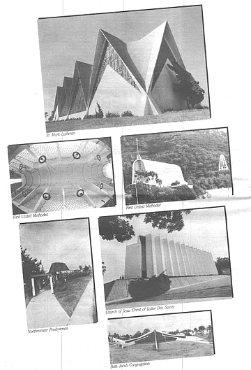
For those who have never taken too much notice of contemporary churches in San Diego and for whom it may be a new idea that there are things about them that aren’t at all right, there follows below some illustrations, with critique.
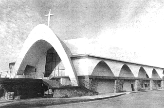
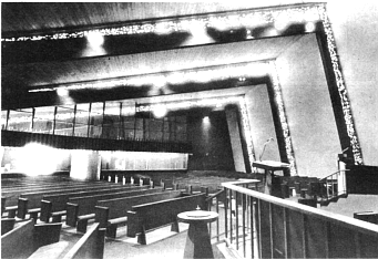
Example: Amid the manic bric-a-brac that is the architectural carnival of Mission Valley, the First United Methodist Church is a featured performer. It’s located on the south side of I-8 across from Mission Valley Center and consists of a row of seventy-foot-tall concrete arches spaced by tracery windows.
The structure was designed twenty years ago by Reginald Inwood and the Chicago firm of Perkins and Will, and built at a cost of $1.6 million. Possibly the most costly religious structure in San Diego, its construction in 1963 represented one of the most ambitious tilt-up jobs for precast concrete ever attempted on the West Coast.
Happy to be out of their old building at Ninth and C downtown (a brooding Gothic Revival mistake — complete with gargoyles — by Irving Gill), the First United congregation is fond of referring to the new building as “The Cathedral of the Valley. “ I, on the other hand, have entered the thing in my Journal under a somewhat different description: “Looks like a monstrous Conestoga wagon that's lost its wheels . . . a line of huge croquet wickets draped in white like an alumni tent for a reunion of giants . . . . Inside, it’s like the body cavity of a whale, colossal white ribs and all.” So much for a sail hung between trees.
Example: The St. Mark Lutheran Church on Santa Fe Drive in Encinitas practically attacks passing automobiles. One might well fear to walk near it alone at night. Designed by Walter H. Hagedohm of Los Angeles and completed in 1961, it is a collection of ten tall, pointed arches holding stained-glass windows, the arches connected by a thin concrete shell that forms the roof and sidewalls as it curves in and out. The building sits practically on the sidewalk on the edge of a quiet neighborhood of beach bungalows and it carries these notes in my Journal: “A gaudy funhouse waiting for Halloween. Inside, the curves of the shell descend between the windows like huge cows’ udders, and the masses of bright stained glass that surround it are divided and crisscrossed by heavy black lines that slice and dive in sharp, marauding angles, as if depicting sunspot activity or some other abstract mayhem. Not pleasant.”
Example: A fairly well-known shocker is the Beth Jacob Congregation on College Avenue between El Cajon Boulevard and Montezuma Road, designed by Bill Lewis of Deems Lewis and Partners in San Diego. An orthodox Jewish synagogue, it lies in a slight valley just off the east side of the street and it’s a favorite of the Journal: “Suggests a large, unearthly, spiderlike insect, its stuccoed tentacle-legs spreading out from a round, flat body as it clings to the alien planet. Unlike a spider or an octopus, this animal’s squirming appendages are not uniform in length or shape — some are straight and short, some long and crooked near the ends, differences that apparently are the result of the evolution of specialized functions. The longer, hooked legs are probably for catching and killing food, and the shorter ones for communication or for soil sampling and analysis. Without risking too close an encounter, an observer can trace the tentacles back to an eight-faced head, with surreptitious eyes set deep between the faces. Its rusty, metallic skin is rumored to be highly radioactive.”
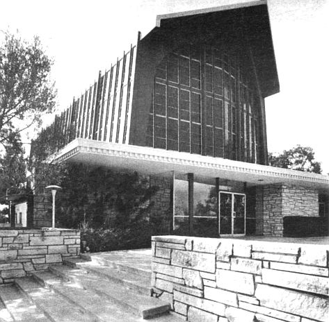
Another Bill Lewis beauty is the Church of Jesus Christ of Latter Day Saints on Trojan Avenue just off Fifty-fourth Street in San Diego. In a neighborhood of very simple, single-family houses, it is such a bizarre structure that it’s difficult to believe it could be permanent, or as the Journal notes, “You find yourself waiting for — no, hoping for — the circus crew to show up with elephants to dismantle the thing and move it to the next town.”
The building is rectangular in plan, and features an amazing-looking set of tall panels that zigzag along each side of the building. Skylights of orange-tinted glass sit atop the panels along with sharp spikes thrusting toward the sky, and more spikes sprouting from a hollow cylindrical ornament that rides over the roof at the front wall. The whole building is white, and as it parties beside Trojan Avenue amid its flat green lawn, it simply cannot be avoided or ignored.
If the architect and the congregation are happy that their sanctuary has achieved such eminence, the Journal is not: “It truly looks like something out of Star Wars, like a stage-set fortress of a minor galactic prince. Without the small marquee out front announcing it to be a church, I wouldn’t be surprised to see crowds of kids lined up to get into the most extravagant video-game palace on earth. When aliens finally arrive from space to take over the planet, this will surely qualify as one of their seats of government.”
Is it foolish or unrealistic or selfish to expect that people have a right to protection from assault in their own neighborhoods by the evangelistic roaring and oppressive, righteous posturing of religious structures? When the Jehovah's Witnesses come banging on your door, they are at least polite and will go away if you ask them to. When the Sunday morning TV is jammed with religious programming, you can turn it off. Nobody kidnaps you at the door to the Christian Science Reading Room. But when some enraptured congregation decides they need a place to worship God and that that place will be next door to your house, do they consider that you or your neighbors might not share their particular convictions, or that you might not think much of having to live in the literal and figurative shadow of their belligerent, cultic pyramid?
— Journal, “Architecture”
In the category of architects whose strong religious and personal convictions manifest themselves as equally assertive church buildings, Robert Des Lauriers is a local all-star. One of the most prolific church designers in San Diego, with more than forty religious structures to his credit, Des Lauriers, a Lutheran, aggressively defends the right of churches to stand above and apart from their landscape. “A church sanctuary should dominate,” he said in a recent conversation. “It should demand the respect of being looked up to. It should have mass and strength and identity, and it should demonstrate leadership.
“In most theology, there is a definite sense of uplift, of looking up and rising up to heaven, and a church should manifest that uplift. The relationship of man to God is, after all, a vertical idea, not a horizontal one. If it were horizontal, man would be God and vice versa. Instead. God is above man, and one either rises or descends to meet the other.”
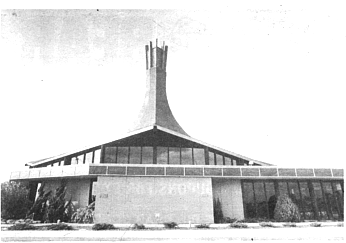
Among Des Lauriers’ most uplifting creations, the Fletcher Hills Presbyterian Church is a good example. It stands on a rise to one side of Fletcher Parkway near the intersection with Navajo Road, and in a manner reminiscent of a European castle commanding the countryside, this circular sanctuary overlooks its suburban fiefdom. The observer has no choice but to look up — that is, unless he happens to be in a plane en route to or from Gillespie Field. Inside, eight large wooden beams converge at the center of the ceiling, about forty feet high, and a hollow shaft rises over that point to the sky, like a trapped miner’s last hope.
Another example is Des Lauriers’ Northminster Presbyterian Church on Clairemont Mesa Boulevard (between Genesee and Clairemont Drive), a blunt cone growing out of the palm trees and surrounded by a snaking concrete walkway and colonnade. The floor plan of the sanctuary is not especially large, but with the walls of the elliptical cone rising directly from the perimeter, an exaggerated sense of height and volume is achieved inside. The height is further accented by a narrow monolithic concrete slab shooting toward the roof from behind the altar. The slab bears a mosaiclike design of an abstracted, towering cross.
In each case, Des Lauriers has succeeded in drawing one’s attention upward, but, according to the Journal, he does so at the risk of creating more of D.S. Miller’s “vaudeville." In the Journal, the Fletcher Hills church reads: “An exotic revolving restaurant on a hill . . . the asphalt-shingled roof rises from its undulating octagonal edge up into a kind of smokestack-like projection stuffed at the top with eight two-by-twelve-inch boards and a pointy white cross, all cemented together with a pudding of mortar and chunks of colored glass. . . . Looks a little like something out of a South Seas theme park — might be a great place for a luau and a roasted pig.” The Northminster Presbyterian becomes “a volcano cone sliced vertically a dozen times [for colored glass windows], as if about to be peeled. The building goes around and opens at the seams like a poorly glued toy breaking apart from the centrifugal force of spinning.”
It’s unlikely that such irreverent evaluations of his work will bother Des Lauriers, as he believes that in addition to a church's intrinsic right to imperial posture, it should also serve to attract people by catching the eye and the imagination. “The initial building costs of church edifices might seem high,” he says, “but the structures themselves, if well done, can generate memberships and money.” As an example. he cites the Crystal Cathedral in Garden Grove, whose cost of nearly $30 million will in time represent but a fraction of the money it will generate in contributions and television revenue. (The church was the brainchild of the video priest Robert Schuller.) Des Lauries also notes the First United Methodist Church in Mission Valley, whose initial costs were extreme but whose revenues are now adequate enough for the congregation to be embarking on the construction of new buildings for the complex. “The edifice itself has a great deal to do with their [the congregation’s] success,” he says, suggesting that if a church building is special in some way, the drawing power of the evangelism and of the worship that takes place inside it will be significantly enhanced.
To that end, Des Lauriers must consider his work successful design, for his churches are clearly capable of catching the attention of even the dullest of passers-by. Two more local examples are noteworthy in that regard: the Clairemont Lutheran Church on Clairemont Mesa Boulevard and the First Assembly of God on Phyllis Place above Mission Valley.
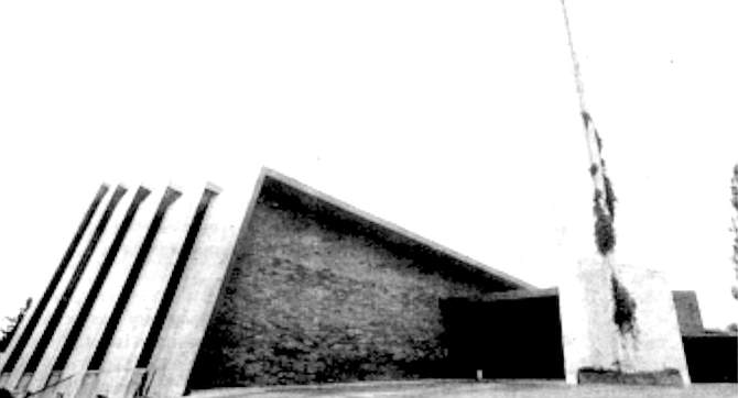
The first stands diagonally across the street from the Northminster Presbyterian Church, close enough, in fact, that the two congregations could probably shout blessings to each other from their doorways. The sanctuary is a row of L-shaped concrete slabs, each piece tipped over so that the long side of the L forms the slightly inclined roof and the short side forms the tilted side wall. The units are different sizes and are lined up with the smallest in front, the next biggest behind it, and so on until the last one stands some seventy feet high and meets the back wall of the building. The narrow creases that are left between one unit and the next are filled with a porridge of mortar and chunks of colored acrylic plastic — a concoction representing the seemingly inevitable stained-glass-window effect. (Of the nearly two dozen contemporary churches I’ve visited in San Diego, only one is without some version of stained glass.) Inside, a stylized, vertical wooden-fin motif seems to prevail — thick pointed slats in rising and falling rows, like the fins of a long radiator — and the colored plastic is bright and visually magnetic as it climbs one wall and spans the ceiling in receding skinny rows.
The sanctuary succeeds in being unique in appearance, especially on the exterior, but while it might easily convert the casual to the curious, I can find nothing in my Journal to suggest that upon seeing it, I was moved to join up. “Half a dozen lean-tos waiting for holiday campers” or “a huge pullout puzzle that might do well pushed back together and put away” hardly reads like a religious conversion. Nor was I impressed by the distraction of the windows: “. . . Like hundreds of glowing shards of glass draining through narrow pipes, as if a whole neighborhood of kids had flushed all their marbles down toilets at once.”
Apparently, neither my membership nor the pronouncements of my Journal are missed by the folks at Clairemont Lutheran, for they have a thriving congregation of 500 families, and the church’s senior pastor. Reverend Vance Knutsen, credits the design of his sanctuary with part of the success. And a similar story can be told about Des Lauriers’ First Assembly of God.
From a perch on the northern rim of Mission Valley — almost directly opposite the First United Methodist Church — the seven-year-old, SI .4 million sanctuary and church offices project looks contentedly out over the valley. With one of the largest sanctuary seating capacities in San Diego (1500). the church has managed to draw sufficient attendance and contributions to pay bills, to support an extensive foreign missionary program, and to construct a senior citizens’ housing project next door.
If the architecture of the place is to be given partial credit for the church’s draw, several things deserve special mention. In the spacious interior of the sanctuary, Des Lauriers has installed a variation of the decorative wooden-fin motif seen in his Clairemont Lutheran, and with it a pair of large stained-glass pieces artificially lit
from behind. (What the fins are or mean I never did ask, for fear of ruining the fun of guessing.) Behind the large stage at the head of the church, the wall is a long face of rough, decorative rock, broken only by an area in the middle that showcases an internally lighted, stained-glass cross backed by green drapes.
This careful but strange interior may attract and please worshippers, but I was only compelled to make the following note in the Journal: “Seeing all that phony-looking stone and the drapes like an old movie house curtain, 1 couldn’t help thinking that if the cross were replaced by an equally gaudy water fountain, and a bar installed in front of the stage, the place could easily pass for a small town’s idea of a nightclub. (My guess is that if the good people of the First Assembly of God have not made a similar observation, it’s because they don’t frequent the same sorts of places I do when in small towns and are therefore, for better or worse, possessed of a more pristine point of reference.)”
Another man who doesn’t shrink from the architectural holy wars is Los Angeles architect Hal Whittemore of Whittemore and Lowe. Whittemore has been involved in the design of more than 150 churches, including two in San Diego, the St. Mark's United Methodist on Clairemont Drive south of Balboa Avenue and the St. Paul’s United Methodist in Coronado. As bold in his design and personal philosophy as Des Lauriers, Whittemore, a Presbyterian, declares, “A church should advertise itself. It should make a statement to the community. Some of the statements made in theology are pretty strong stuff, and I feel that a congregation has to be ready to be strong in their own expressions.
“The congregation should be excited about what it’s doing in the community, and if they’re not excited, they’re being hypocritical. I’d rather do a good bar than a hypocritical church.”
Though Whittemore shied from the comparison in a recent phone conversation, his St. Mark’s church in Clairemont owes lineal royalties to August Perret’s 1922 church of Notre Dame at Le Rainey, just outside Paris, and to earlier Gothic structures in which the tracery windows took up the whole wall. The newer church is a giant glass bread box trimmed in flat-brown and bright-blue colors. Large wooden beams, arranged in imitation of old vaulted ceilings, support the structure, allowing three of the walls to carry virtually uninterrupted areas of stained glass in dark blues and violets.
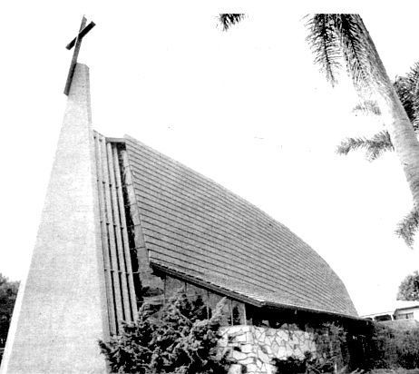
His St. Paul’s church in Coronado is a modified A-frame building that bellies out in the middle of its length and carries stubby wings up to about a third of its height. It owns a dull-brown, clay-tile roof and a sixty-foot stuccoed monolith that tilts forward slightly and leads The Church of the Voyager like the prow of a bulky boat plowing stubbornly through the heathen storms of the modem world.
In each church, Whittemore’s design strengths are in his interiors. In fact, in nearly all of the churches described above, if there are sensible, well-balanced elements of design, they occur in the interiors, “for it is in the interiors,” the Journal explains, “that specific patterns for worship and definitive requirements of liturgy are imposed on the architect and the congregation.” Whittemore’s two San Diego churches are simple and sane on the inside, cool and comfortable. They could easily be not so, especially the St. Mark’s church in Clairemont, if his feeling for stained glass did not run, as it does, toward the rich blue palette. Whittemore makes good use of such “organic” touches as the live plants and potted trees that grow behind the altars in natural light that enters stealthily from the forward corners of both churches. The Journal reports both buildings “likely to be wonderful places to relax on a too-hot summer’s day,” but it is less pleased with the exteriors of the buildings, especially as they relate to their environments.
The St. Mark’s United Methodist, according to the Journal, “is as stark a surprise on the landscape as you could expect on that otherwise predictable stretch of Clairemont Drive. It makes no attempt whatsoever to ease you into its picture or to vitiate the rudeness of being so bloody loud. On the contrary, its electric-blue trim against fiat brown is like a banner advertising the place. Does it keep the neighbors awake at night?” In Coronado, the St. Paul’s church is of a smaller scale than its Clairemont cousin, and less bright, but given its staid surroundings, the old neighborhood of Seventh and D streets, the contrast might be more severe. In the Journal, it “stands up maybe forty feet out of quiet old Coronado — manicured lawns, narrow streets, elegantly compact white houses aging gracefully — like a dusty, scaly, legless bug, leaning, lurching, and swelling in several directions at once. If God were ever to relocate to Coronado (assuming He could afford to), He would surely choose any one of dozens of houses around St. Paul’s to move into before He’d pick the church.”
Perhaps church architects deserve more compassionate treatment. There are so many different pressures on them that their designs can get out of hand at any moment. First there's the congregation - the clients — people excited by dreams of a monument and bearing as many different versions of how it should be accomplished as there are individuals in the group. Then there’s history, the nagging traditions of the great Catholic cathedrals, and the subsequent problems of inventing new traditions after the Reformation. But the biggest problem is that the business involves God. No one has created more confusion throughout history for the people of this planet than God. For the average architect, the responsibility of putting God into a building without making a mockery of the idea or of the building is a hell of a cross to bear.
— Journal, “Architecture”
If Des Lauriers’ and Whittemore’s designs become what they are through personal conviction and confident force of will, such is not necessarily the case with other architects, many of whom, consciously or unconsciously, become victims of the design process peculiar to church work. “Designing a church isn’t an easy thing,” says local architect Stan Keniston, “and one big reason is that you’re dealing with a building committee, a group of people, rather than with a single individual or just a few individuals.” Keniston’s partner. Jack Mosher, agrees and relates an anecdote: “I worked for a firm that took a church job, and in one of our first meetings with the building committee, a fistfight nearly broke out among the church people over what they wanted. ”
Keniston and Mosher pointed out that many a young architect will take his first church commission and become so discouraged with the group decision-making process that he'll never take on another. (Even Des Lauriers admits that one of the most difficult parts of his job is keeping his patience with large church building committees.) And as it is the architect’s job to satisfy his client, we can also assume that, if and when members of the building committee do reach some firm decision on a concept for their church, the architect may find himself stuck with a full-grown white elephant before he ever gets to the drawing board. If a completed sanctuary seems bizarre and outlandish to us, rather than blaming the architect for the mess, we might often do well to congratulate him for not letting it get as bad as it could have.
As if a possessed building committee, fighting and talking in tongues, weren't bad enough, an architect can further burden himself with his own confusion over the concepts and myths of God and religion, and with what they should mean to his design. He must deal with his personal theories of the holy supernatural, with the relevance of other religious monuments of the past and present, and with the lofty pronouncements of theoreticians.
One problem with the design of contemporary churches might be that their architects are not necessarily artists by nature. Many tend to be more the analytical thinkers - engineers or mechanical tinkerers - than the lyrical thinkers. Such people are fine so long as they're confined to projects that require mainly functional and rectilinear solutions. But they can get into trouble when the dreamy church building committee comes along and lets them out of their boxes onto unfamiliar territory - that of bringing a spiritual vision into three dimensions. There, the solution might demand the balanced creative perspective of a true artist, and a church commission can be a disaster for an architect who is not so disposed.
— Journal, “Architecture”
There is ample evidence in many of these contemporary churches to suggest that their architects were acting like amateur artists attempting sculptural answers to the demands of the congregations. One fresh example of that is Richard Greene’s North Clairemont United Methodist Church on Mt. Herbert Avenue off Genesee. In addition to orienting the church and prayer tower toward the busy street (from which there is no direct entrance to the church) in an annoying posture of self-advertisement, Greene attempted to lay colored glass into irregularly sized and spaced rectangular windows that occur in thickened areas of the stuccoed walls. The effect is a more or less direct plagiarism of the windows in the famous chapel at Ron-champ, France, by the renowned architect Le Corbusier. But to see the original and then the imitator is to compare a great artist with your Aunt Clara, who goes to a weekend class to paint the eucalyptus trees in Balboa Park. To make things worse, Greene added an unlikely bunch of brown wood trim around the exterior of his windows, which, according to the Journal, gives the appearance of “a swarm of long-legged insects clinging to the side of the building.”
When asked recently to explain his work at North Clairemont. Greene admitted the connection to Ronchamp and offered further logical-sounding narrative describing the genesis of the various design concepts in the church. Then, in a telltale addendum, he unconsciously offered a glimpse into the mechanism that doomed his design to artless extravagance, and that certainly affects his colleagues in similar ways. “Churches,” he said, “are the most romantic architecture you can do. They provoke the most emotion. For architects, churches can be the most fun. You can be playful, you can let symbolisms happen, you have a chance to make a stronger statement than in other buildings. Architects remember their history, and they know that churches are the lasting marks of civilizations.”
Back at the Pannikin, I ordered another mug of the rocket fuel they persist in calling coffee. All around me sensitive souls mused and ruminated as deliberately as the Kenya A A would allow, and occasionally one and another would scratch some profundity into their journals, obviously pained and struggling with the terrible responsibility of being Sensitive Writers.
As I thumbed through the “Architecture” section of my own journal, I wondered whether I was being too hard on the churches. It’s easy to criticize, I thought to myself, but difficult to create. (The phrase sounded snappy enough to be recorded, so I entered it under “Patience.”) I decided I was glad that I was neither wildly religious nor an architect who had to satisfy those who were.
As for alternatives to the buildings I was so critical of, I felt that they shouldn’t be so hard to come by: if God were around. He’d probably be the first to say that neither faith nor religious practice, buildings included, need be too complicated. I imagined Him sitting in a quiet comer at the Pannikin, a tall, skinny fellow in a baseball cap and black, high-topped sneakers, sipping a mug o’joe, saying, “You know. I’d rather see folks tie canvas between a couple of trees and do their prayin’ there. There’s a hell of a lot better things to be spendin’ money on than these crazy churches.”


While God does enraged backflips in Heaven, the people of the Earth build churches. Ever since the Roman Catholic church leaders of old Europe, taking a cue from the pyramids of the pharaohs, decided that bigger was better and that the Fear of God was sufficient motivation to keep whole towns hard at work for generations building monuments to the egos of the archbishops, the style of church architecture has been relatively consistent and can be defined within three general categories: Grotesque, Neo-Grotesque, and Grotesque Moderne. In San Diego, the fact that we are primarily a twentieth-century city means that most of our churches fall into the last category. Grotesque Moderne, and into the local subdivision of the grouping Grotesque Moderne Especial.
— from the author’s Sensitive Writer's Journal, “Architecture” section

Not too many days ago I sat at the Pannikin in La Jolla, sipping my fourth mug of Kenya AA coffee, elbow to notebook with a crowd of others like myself — introspective friends of caffeine, looking literary and scribbling cogent observations of the real and imagined world into their Sensitive Writer’s Journals.

Some plotted novels, some broke their hearts into poems, some reorganized Kant, Hegel, and Nietzsche for the benefit of the confused. Me, I was back under the “Architecture” heading, noticing how much comment I had collected on the subject of contemporary church design.

I realized I’d been spotting them for years as I drove through the city: odd buildings, usually much taller than their surroundings, strangely shaped and colored, sometimes spiked or violently angular, perforated by colored glass or plastic, and should be powerfully designed, highly visible monuments to religion.

For those who have never taken too much notice of contemporary churches in San Diego and for whom it may be a new idea that there are things about them that aren’t at all right, there follows below some illustrations, with critique.

Example: Amid the manic bric-a-brac that is the architectural carnival of Mission Valley, the First United Methodist Church is a featured performer. It’s located on the south side of I-8 across from Mission Valley Center and consists of a row of seventy-foot-tall concrete arches spaced by tracery windows.

The structure was designed twenty years ago by Reginald Inwood and the Chicago firm of Perkins and Will, and built at a cost of $1.6 million. Possibly the most costly religious structure in San Diego, its construction in 1963 represented one of the most ambitious tilt-up jobs for precast concrete ever attempted on the West Coast.

Happy to be out of their old building at Ninth and C downtown (a brooding Gothic Revival mistake — complete with gargoyles — by Irving Gill), the First United congregation is fond of referring to the new building as “The Cathedral of the Valley. “ I, on the other hand, have entered the thing in my Journal under a somewhat different description: “Looks like a monstrous Conestoga wagon that's lost its wheels . . . a line of huge croquet wickets draped in white like an alumni tent for a reunion of giants . . . . Inside, it’s like the body cavity of a whale, colossal white ribs and all.” So much for a sail hung between trees.
Example: The St. Mark Lutheran Church on Santa Fe Drive in Encinitas practically attacks passing automobiles. One might well fear to walk near it alone at night. Designed by Walter H. Hagedohm of Los Angeles and completed in 1961, it is a collection of ten tall, pointed arches holding stained-glass windows, the arches connected by a thin concrete shell that forms the roof and sidewalls as it curves in and out. The building sits practically on the sidewalk on the edge of a quiet neighborhood of beach bungalows and it carries these notes in my Journal: “A gaudy funhouse waiting for Halloween. Inside, the curves of the shell descend between the windows like huge cows’ udders, and the masses of bright stained glass that surround it are divided and crisscrossed by heavy black lines that slice and dive in sharp, marauding angles, as if depicting sunspot activity or some other abstract mayhem. Not pleasant.”
Example: A fairly well-known shocker is the Beth Jacob Congregation on College Avenue between El Cajon Boulevard and Montezuma Road, designed by Bill Lewis of Deems Lewis and Partners in San Diego. An orthodox Jewish synagogue, it lies in a slight valley just off the east side of the street and it’s a favorite of the Journal: “Suggests a large, unearthly, spiderlike insect, its stuccoed tentacle-legs spreading out from a round, flat body as it clings to the alien planet. Unlike a spider or an octopus, this animal’s squirming appendages are not uniform in length or shape — some are straight and short, some long and crooked near the ends, differences that apparently are the result of the evolution of specialized functions. The longer, hooked legs are probably for catching and killing food, and the shorter ones for communication or for soil sampling and analysis. Without risking too close an encounter, an observer can trace the tentacles back to an eight-faced head, with surreptitious eyes set deep between the faces. Its rusty, metallic skin is rumored to be highly radioactive.”
Another Bill Lewis beauty is the Church of Jesus Christ of Latter Day Saints on Trojan Avenue just off Fifty-fourth Street in San Diego. In a neighborhood of very simple, single-family houses, it is such a bizarre structure that it’s difficult to believe it could be permanent, or as the Journal notes, “You find yourself waiting for — no, hoping for — the circus crew to show up with elephants to dismantle the thing and move it to the next town.”
The building is rectangular in plan, and features an amazing-looking set of tall panels that zigzag along each side of the building. Skylights of orange-tinted glass sit atop the panels along with sharp spikes thrusting toward the sky, and more spikes sprouting from a hollow cylindrical ornament that rides over the roof at the front wall. The whole building is white, and as it parties beside Trojan Avenue amid its flat green lawn, it simply cannot be avoided or ignored.
If the architect and the congregation are happy that their sanctuary has achieved such eminence, the Journal is not: “It truly looks like something out of Star Wars, like a stage-set fortress of a minor galactic prince. Without the small marquee out front announcing it to be a church, I wouldn’t be surprised to see crowds of kids lined up to get into the most extravagant video-game palace on earth. When aliens finally arrive from space to take over the planet, this will surely qualify as one of their seats of government.”
Is it foolish or unrealistic or selfish to expect that people have a right to protection from assault in their own neighborhoods by the evangelistic roaring and oppressive, righteous posturing of religious structures? When the Jehovah's Witnesses come banging on your door, they are at least polite and will go away if you ask them to. When the Sunday morning TV is jammed with religious programming, you can turn it off. Nobody kidnaps you at the door to the Christian Science Reading Room. But when some enraptured congregation decides they need a place to worship God and that that place will be next door to your house, do they consider that you or your neighbors might not share their particular convictions, or that you might not think much of having to live in the literal and figurative shadow of their belligerent, cultic pyramid?
— Journal, “Architecture”
In the category of architects whose strong religious and personal convictions manifest themselves as equally assertive church buildings, Robert Des Lauriers is a local all-star. One of the most prolific church designers in San Diego, with more than forty religious structures to his credit, Des Lauriers, a Lutheran, aggressively defends the right of churches to stand above and apart from their landscape. “A church sanctuary should dominate,” he said in a recent conversation. “It should demand the respect of being looked up to. It should have mass and strength and identity, and it should demonstrate leadership.
“In most theology, there is a definite sense of uplift, of looking up and rising up to heaven, and a church should manifest that uplift. The relationship of man to God is, after all, a vertical idea, not a horizontal one. If it were horizontal, man would be God and vice versa. Instead. God is above man, and one either rises or descends to meet the other.”
Among Des Lauriers’ most uplifting creations, the Fletcher Hills Presbyterian Church is a good example. It stands on a rise to one side of Fletcher Parkway near the intersection with Navajo Road, and in a manner reminiscent of a European castle commanding the countryside, this circular sanctuary overlooks its suburban fiefdom. The observer has no choice but to look up — that is, unless he happens to be in a plane en route to or from Gillespie Field. Inside, eight large wooden beams converge at the center of the ceiling, about forty feet high, and a hollow shaft rises over that point to the sky, like a trapped miner’s last hope.
Another example is Des Lauriers’ Northminster Presbyterian Church on Clairemont Mesa Boulevard (between Genesee and Clairemont Drive), a blunt cone growing out of the palm trees and surrounded by a snaking concrete walkway and colonnade. The floor plan of the sanctuary is not especially large, but with the walls of the elliptical cone rising directly from the perimeter, an exaggerated sense of height and volume is achieved inside. The height is further accented by a narrow monolithic concrete slab shooting toward the roof from behind the altar. The slab bears a mosaiclike design of an abstracted, towering cross.
In each case, Des Lauriers has succeeded in drawing one’s attention upward, but, according to the Journal, he does so at the risk of creating more of D.S. Miller’s “vaudeville." In the Journal, the Fletcher Hills church reads: “An exotic revolving restaurant on a hill . . . the asphalt-shingled roof rises from its undulating octagonal edge up into a kind of smokestack-like projection stuffed at the top with eight two-by-twelve-inch boards and a pointy white cross, all cemented together with a pudding of mortar and chunks of colored glass. . . . Looks a little like something out of a South Seas theme park — might be a great place for a luau and a roasted pig.” The Northminster Presbyterian becomes “a volcano cone sliced vertically a dozen times [for colored glass windows], as if about to be peeled. The building goes around and opens at the seams like a poorly glued toy breaking apart from the centrifugal force of spinning.”
It’s unlikely that such irreverent evaluations of his work will bother Des Lauriers, as he believes that in addition to a church's intrinsic right to imperial posture, it should also serve to attract people by catching the eye and the imagination. “The initial building costs of church edifices might seem high,” he says, “but the structures themselves, if well done, can generate memberships and money.” As an example. he cites the Crystal Cathedral in Garden Grove, whose cost of nearly $30 million will in time represent but a fraction of the money it will generate in contributions and television revenue. (The church was the brainchild of the video priest Robert Schuller.) Des Lauries also notes the First United Methodist Church in Mission Valley, whose initial costs were extreme but whose revenues are now adequate enough for the congregation to be embarking on the construction of new buildings for the complex. “The edifice itself has a great deal to do with their [the congregation’s] success,” he says, suggesting that if a church building is special in some way, the drawing power of the evangelism and of the worship that takes place inside it will be significantly enhanced.
To that end, Des Lauriers must consider his work successful design, for his churches are clearly capable of catching the attention of even the dullest of passers-by. Two more local examples are noteworthy in that regard: the Clairemont Lutheran Church on Clairemont Mesa Boulevard and the First Assembly of God on Phyllis Place above Mission Valley.
The first stands diagonally across the street from the Northminster Presbyterian Church, close enough, in fact, that the two congregations could probably shout blessings to each other from their doorways. The sanctuary is a row of L-shaped concrete slabs, each piece tipped over so that the long side of the L forms the slightly inclined roof and the short side forms the tilted side wall. The units are different sizes and are lined up with the smallest in front, the next biggest behind it, and so on until the last one stands some seventy feet high and meets the back wall of the building. The narrow creases that are left between one unit and the next are filled with a porridge of mortar and chunks of colored acrylic plastic — a concoction representing the seemingly inevitable stained-glass-window effect. (Of the nearly two dozen contemporary churches I’ve visited in San Diego, only one is without some version of stained glass.) Inside, a stylized, vertical wooden-fin motif seems to prevail — thick pointed slats in rising and falling rows, like the fins of a long radiator — and the colored plastic is bright and visually magnetic as it climbs one wall and spans the ceiling in receding skinny rows.
The sanctuary succeeds in being unique in appearance, especially on the exterior, but while it might easily convert the casual to the curious, I can find nothing in my Journal to suggest that upon seeing it, I was moved to join up. “Half a dozen lean-tos waiting for holiday campers” or “a huge pullout puzzle that might do well pushed back together and put away” hardly reads like a religious conversion. Nor was I impressed by the distraction of the windows: “. . . Like hundreds of glowing shards of glass draining through narrow pipes, as if a whole neighborhood of kids had flushed all their marbles down toilets at once.”
Apparently, neither my membership nor the pronouncements of my Journal are missed by the folks at Clairemont Lutheran, for they have a thriving congregation of 500 families, and the church’s senior pastor. Reverend Vance Knutsen, credits the design of his sanctuary with part of the success. And a similar story can be told about Des Lauriers’ First Assembly of God.
From a perch on the northern rim of Mission Valley — almost directly opposite the First United Methodist Church — the seven-year-old, SI .4 million sanctuary and church offices project looks contentedly out over the valley. With one of the largest sanctuary seating capacities in San Diego (1500). the church has managed to draw sufficient attendance and contributions to pay bills, to support an extensive foreign missionary program, and to construct a senior citizens’ housing project next door.
If the architecture of the place is to be given partial credit for the church’s draw, several things deserve special mention. In the spacious interior of the sanctuary, Des Lauriers has installed a variation of the decorative wooden-fin motif seen in his Clairemont Lutheran, and with it a pair of large stained-glass pieces artificially lit
from behind. (What the fins are or mean I never did ask, for fear of ruining the fun of guessing.) Behind the large stage at the head of the church, the wall is a long face of rough, decorative rock, broken only by an area in the middle that showcases an internally lighted, stained-glass cross backed by green drapes.
This careful but strange interior may attract and please worshippers, but I was only compelled to make the following note in the Journal: “Seeing all that phony-looking stone and the drapes like an old movie house curtain, 1 couldn’t help thinking that if the cross were replaced by an equally gaudy water fountain, and a bar installed in front of the stage, the place could easily pass for a small town’s idea of a nightclub. (My guess is that if the good people of the First Assembly of God have not made a similar observation, it’s because they don’t frequent the same sorts of places I do when in small towns and are therefore, for better or worse, possessed of a more pristine point of reference.)”
Another man who doesn’t shrink from the architectural holy wars is Los Angeles architect Hal Whittemore of Whittemore and Lowe. Whittemore has been involved in the design of more than 150 churches, including two in San Diego, the St. Mark's United Methodist on Clairemont Drive south of Balboa Avenue and the St. Paul’s United Methodist in Coronado. As bold in his design and personal philosophy as Des Lauriers, Whittemore, a Presbyterian, declares, “A church should advertise itself. It should make a statement to the community. Some of the statements made in theology are pretty strong stuff, and I feel that a congregation has to be ready to be strong in their own expressions.
“The congregation should be excited about what it’s doing in the community, and if they’re not excited, they’re being hypocritical. I’d rather do a good bar than a hypocritical church.”
Though Whittemore shied from the comparison in a recent phone conversation, his St. Mark’s church in Clairemont owes lineal royalties to August Perret’s 1922 church of Notre Dame at Le Rainey, just outside Paris, and to earlier Gothic structures in which the tracery windows took up the whole wall. The newer church is a giant glass bread box trimmed in flat-brown and bright-blue colors. Large wooden beams, arranged in imitation of old vaulted ceilings, support the structure, allowing three of the walls to carry virtually uninterrupted areas of stained glass in dark blues and violets.
His St. Paul’s church in Coronado is a modified A-frame building that bellies out in the middle of its length and carries stubby wings up to about a third of its height. It owns a dull-brown, clay-tile roof and a sixty-foot stuccoed monolith that tilts forward slightly and leads The Church of the Voyager like the prow of a bulky boat plowing stubbornly through the heathen storms of the modem world.
In each church, Whittemore’s design strengths are in his interiors. In fact, in nearly all of the churches described above, if there are sensible, well-balanced elements of design, they occur in the interiors, “for it is in the interiors,” the Journal explains, “that specific patterns for worship and definitive requirements of liturgy are imposed on the architect and the congregation.” Whittemore’s two San Diego churches are simple and sane on the inside, cool and comfortable. They could easily be not so, especially the St. Mark’s church in Clairemont, if his feeling for stained glass did not run, as it does, toward the rich blue palette. Whittemore makes good use of such “organic” touches as the live plants and potted trees that grow behind the altars in natural light that enters stealthily from the forward corners of both churches. The Journal reports both buildings “likely to be wonderful places to relax on a too-hot summer’s day,” but it is less pleased with the exteriors of the buildings, especially as they relate to their environments.
The St. Mark’s United Methodist, according to the Journal, “is as stark a surprise on the landscape as you could expect on that otherwise predictable stretch of Clairemont Drive. It makes no attempt whatsoever to ease you into its picture or to vitiate the rudeness of being so bloody loud. On the contrary, its electric-blue trim against fiat brown is like a banner advertising the place. Does it keep the neighbors awake at night?” In Coronado, the St. Paul’s church is of a smaller scale than its Clairemont cousin, and less bright, but given its staid surroundings, the old neighborhood of Seventh and D streets, the contrast might be more severe. In the Journal, it “stands up maybe forty feet out of quiet old Coronado — manicured lawns, narrow streets, elegantly compact white houses aging gracefully — like a dusty, scaly, legless bug, leaning, lurching, and swelling in several directions at once. If God were ever to relocate to Coronado (assuming He could afford to), He would surely choose any one of dozens of houses around St. Paul’s to move into before He’d pick the church.”
Perhaps church architects deserve more compassionate treatment. There are so many different pressures on them that their designs can get out of hand at any moment. First there's the congregation - the clients — people excited by dreams of a monument and bearing as many different versions of how it should be accomplished as there are individuals in the group. Then there’s history, the nagging traditions of the great Catholic cathedrals, and the subsequent problems of inventing new traditions after the Reformation. But the biggest problem is that the business involves God. No one has created more confusion throughout history for the people of this planet than God. For the average architect, the responsibility of putting God into a building without making a mockery of the idea or of the building is a hell of a cross to bear.
— Journal, “Architecture”
If Des Lauriers’ and Whittemore’s designs become what they are through personal conviction and confident force of will, such is not necessarily the case with other architects, many of whom, consciously or unconsciously, become victims of the design process peculiar to church work. “Designing a church isn’t an easy thing,” says local architect Stan Keniston, “and one big reason is that you’re dealing with a building committee, a group of people, rather than with a single individual or just a few individuals.” Keniston’s partner. Jack Mosher, agrees and relates an anecdote: “I worked for a firm that took a church job, and in one of our first meetings with the building committee, a fistfight nearly broke out among the church people over what they wanted. ”
Keniston and Mosher pointed out that many a young architect will take his first church commission and become so discouraged with the group decision-making process that he'll never take on another. (Even Des Lauriers admits that one of the most difficult parts of his job is keeping his patience with large church building committees.) And as it is the architect’s job to satisfy his client, we can also assume that, if and when members of the building committee do reach some firm decision on a concept for their church, the architect may find himself stuck with a full-grown white elephant before he ever gets to the drawing board. If a completed sanctuary seems bizarre and outlandish to us, rather than blaming the architect for the mess, we might often do well to congratulate him for not letting it get as bad as it could have.
As if a possessed building committee, fighting and talking in tongues, weren't bad enough, an architect can further burden himself with his own confusion over the concepts and myths of God and religion, and with what they should mean to his design. He must deal with his personal theories of the holy supernatural, with the relevance of other religious monuments of the past and present, and with the lofty pronouncements of theoreticians.
One problem with the design of contemporary churches might be that their architects are not necessarily artists by nature. Many tend to be more the analytical thinkers - engineers or mechanical tinkerers - than the lyrical thinkers. Such people are fine so long as they're confined to projects that require mainly functional and rectilinear solutions. But they can get into trouble when the dreamy church building committee comes along and lets them out of their boxes onto unfamiliar territory - that of bringing a spiritual vision into three dimensions. There, the solution might demand the balanced creative perspective of a true artist, and a church commission can be a disaster for an architect who is not so disposed.
— Journal, “Architecture”
There is ample evidence in many of these contemporary churches to suggest that their architects were acting like amateur artists attempting sculptural answers to the demands of the congregations. One fresh example of that is Richard Greene’s North Clairemont United Methodist Church on Mt. Herbert Avenue off Genesee. In addition to orienting the church and prayer tower toward the busy street (from which there is no direct entrance to the church) in an annoying posture of self-advertisement, Greene attempted to lay colored glass into irregularly sized and spaced rectangular windows that occur in thickened areas of the stuccoed walls. The effect is a more or less direct plagiarism of the windows in the famous chapel at Ron-champ, France, by the renowned architect Le Corbusier. But to see the original and then the imitator is to compare a great artist with your Aunt Clara, who goes to a weekend class to paint the eucalyptus trees in Balboa Park. To make things worse, Greene added an unlikely bunch of brown wood trim around the exterior of his windows, which, according to the Journal, gives the appearance of “a swarm of long-legged insects clinging to the side of the building.”
When asked recently to explain his work at North Clairemont. Greene admitted the connection to Ronchamp and offered further logical-sounding narrative describing the genesis of the various design concepts in the church. Then, in a telltale addendum, he unconsciously offered a glimpse into the mechanism that doomed his design to artless extravagance, and that certainly affects his colleagues in similar ways. “Churches,” he said, “are the most romantic architecture you can do. They provoke the most emotion. For architects, churches can be the most fun. You can be playful, you can let symbolisms happen, you have a chance to make a stronger statement than in other buildings. Architects remember their history, and they know that churches are the lasting marks of civilizations.”
Back at the Pannikin, I ordered another mug of the rocket fuel they persist in calling coffee. All around me sensitive souls mused and ruminated as deliberately as the Kenya A A would allow, and occasionally one and another would scratch some profundity into their journals, obviously pained and struggling with the terrible responsibility of being Sensitive Writers.
As I thumbed through the “Architecture” section of my own journal, I wondered whether I was being too hard on the churches. It’s easy to criticize, I thought to myself, but difficult to create. (The phrase sounded snappy enough to be recorded, so I entered it under “Patience.”) I decided I was glad that I was neither wildly religious nor an architect who had to satisfy those who were.
As for alternatives to the buildings I was so critical of, I felt that they shouldn’t be so hard to come by: if God were around. He’d probably be the first to say that neither faith nor religious practice, buildings included, need be too complicated. I imagined Him sitting in a quiet comer at the Pannikin, a tall, skinny fellow in a baseball cap and black, high-topped sneakers, sipping a mug o’joe, saying, “You know. I’d rather see folks tie canvas between a couple of trees and do their prayin’ there. There’s a hell of a lot better things to be spendin’ money on than these crazy churches.”
Comments