Here's something you might be interested in.
Ask a Hipster — Advice you didn't know you needed
Big Screen — Movie commentary
Blurt — Music's inside track
Booze News — San Diego spirits
Classical Music — Immortal beauty
Classifieds — Free and easy
Close to Home — What it’s like on the street where you live
Cover Stories — Front-page features
Drinks All Around — Bartenders' drink recipes
Excerpts — Literary and spiritual excerpts
Feast! — Food & drink reviews
Feature Stories — Local news & stories
Fishing Report — What’s getting hooked from ship and shore
From the Archives — Spotlight on the past
Golden Dreams — Talk of the town
The Gonzo Report — Making the musical scene, or at least reporting from it
Letters — Our inbox
Movies@Home — Local movie buffs share favorites
Movie Reviews — Our critics' picks and pans
Musician Interviews — Up close with local artists
Neighborhood News from Stringers — Hyperlocal news
News Ticker — News & politics
Obermeyer — San Diego politics illustrated
Outdoors — Weekly changes in flora and fauna
Overheard in San Diego — Eavesdropping illustrated
Poetry — The old and the new
Reader Travel — Travel section built by travelers
Reading — The hunt for intellectuals
Roam-O-Rama — SoCal's best hiking/biking trails
San Diego Beer — Inside San Diego suds
SD on the QT — Almost factual news
Sheep and Goats — Places of worship
Special Issues — The best of
Street Style — San Diego streets have style
Surf Diego — Real stories from those braving the waves
Theater — On stage in San Diego this week
Tin Fork — Silver spoon alternative
Under the Radar — Matt Potter's undercover work
Unforgettable — Long-ago San Diego
Unreal Estate — San Diego's priciest pads
Your Week — Daily event picks
San Diego's war over beige
Color!
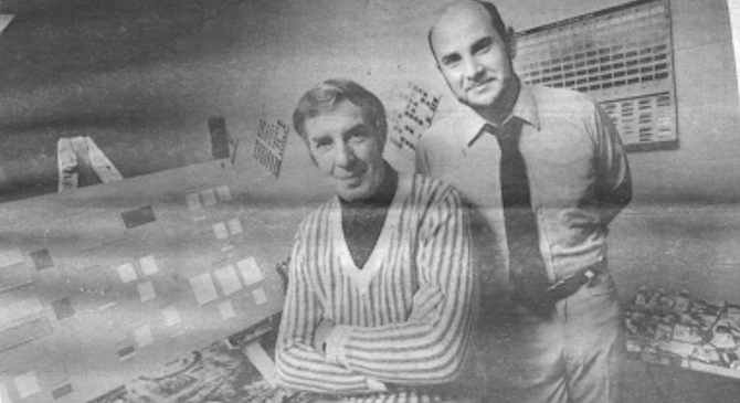
Rudolf and Frank Mahnke: the majority of architectural and design offices in San Diego are white or off-white.
Whenever Rudolf and Frank Mahnke meet a skeptic, they should take him down to Southwood. The Mahnkes are color specialists — and more than that, really.
They believe that human beings actually change with the color on the walls around them, and that people should — really must — color their surroundings wisely to avoid psychological and even physiological harm.
Southwood is a Chula Vista psychiatric center for disturbed children and teenagers. The administrators say those kids have always tended to be destructive. Over the years they would commonly grab pool cues and punch holes in Southwood’s ceilings. They smashed chairs and ripped their desk drawers apart. Routinely, they lobbed things through the windows of the converted convalescent hospital. But about two years ago the administrators heard about the Mahnkes and hired them. The father-and-son team came in and measured light levels and studied Southwood’s blueprints and finally produced a plan detailing precisely what colors each of the hundreds of surfaces within the center should be painted. “The remodeling started in early 1979, and the painters went through a unit at a time,” says staff member Grace Conlee. She says that as each unit was completed, the vandalism diminished. By the conclusion of the whole job, “the destruction had dropped off to almost next to nothing. The deliberate, angry destruction simply ended. We just don’t have it anymore,” Conlee says unemotionally. “It’s incredible.”
“Now, doesn’t that tell you something?” the Mahnkes ask excitedly. Rudolf, the father, in particular grows heated when he talks about color. “What happened at Southwood wasn’t just some fluke!” he cries. The effects of color on humans have been soundly established by scientific research, and people here could be applying those principles widely. The Mahnkes are German, and they say Western Europeans have been following such principles for at least two decades; the Russians know more about the nonvisual effects of color than anyone. If San Diego schools were colored properly, learning would boom. If factories were colored rationally, productivity would soar. The Mahnkes have been researching the use of color in San Diego for seven years, and they’re ready to leave this city in disgust.
But for the moment, Frank Mahnke has returned to Southwood to conduct a little tour. He says that before he and his father produced the current color layout, the facility had been redecorated at least twice in eight years. When the Mahnkes first viewed it, the hallways were stark white with big bright stripes, all in primary colors, running down the walls. The rooms each had three white walls and one bright orange one. That gave the place a colorful appearance, Frank says; however, the color was misused on two counts.
First, bright, strong shades of any hue tend to excite people, whereas the psychiatric center really needed a calming atmosphere. Secondly, Frank says color research has shown that “if color is to be psychotherapeutic, it has to be an integral part of the environment, which means all surfaces have to be colored. If you take color and put it on a neutral background like white, then the only thing you’re producing is a certain amount of visual stimulation. It doesn’t act on the human psyche.”
In contrast, the redecorated facility glows with dozens of colors. Most are pastel peaches, yellows, oranges, and light greens, interspersed with rusts and tans. The junior Mahnke points out that different shades are used in each of the center’s wards. In the children’s section, for example, yellows and oranges contrast with bright green trim around the doors and windows. In the adolescent units, the Mahnkes use cooler yellows, greens, and tans on the walls, set off by tangerine trim. Furthermore, in each ward, rooms are painted alternately in cooler and warmer tones so that staff members can try to assign extroverts and introverts to the rooms which best fit their personality type. (Extroverts need the warmer, brighter hues, but introverts placed in the same setting can become anxious, the colorists say.) Adding still more variety is the fact that three walls of each room are painted with one shade, while the fourth is a harmonious color of a slightly different shade. And Mahnke says no more than two rooms on any given ward are identical; still more subtle variations distinguish them.
The net effect looks cozy but at the same time sophisticated; the details reveal the thought that went into the planning. “Now, it’s not really striking." Frank says upon leaving the psychiatric center. His point, however, is that a striking design would do an active disservice to Southwood’s young inhabitants. “You have to make a distinction between interior design and environment creation,” he maintains. “With interior design you care about visual impact. But when you’re talking about having people in an environment who have no say about that environment, then I feel you have to go by guidelines.”
Since Southwood’s administrators followed those guidelines, Frank contends they should never have to redecorate. “It’s a timeless environment. . . . And if you do an environment correctly, you’ll never get bored with it. It gives you just the right amount of stimulation; just the right amount of atmosphere that you need for performing a task, whatever that might be.”
He adds that the existence of the guidelines also implies that the interior design of most mental health facilities should resemble Southwood, though only in a broad sense, he cautions. “For instance, say you take another hospital where the walls of the corridors, instead of being eight feet apart, are twelve feet apart. Well, the reflectance [of the color of one wall upon another] is not that large for the simple reason you’re talking about greater space between the walls. Or if you have a facility that has no children, the look would be different, of course.” Some rules are rigid, Frank says. "For example, if you’re talking about an operating room in a hospital, it should be turquoise — a specific shade of medium blue green.” He says repeated tests have demonstrated that turquoise best reduces glare under intense light, aids in maintaining visual acuity, and helps the medical technicians to discriminate better the colors of blood and tissue by complementing their reddish tints. Frank cites another example of a rigid rule: designers should never use pale blue over large areas, because research has shown that pale blue is sharply refracted by the lens of the eye. “You can’t really seem to focus on it,” Frank explains. “It tends to make things adjacent to it look blurry.”
Frank has returned to his own bright yellow Volkswagen bug and is heading north on Interstate 5. Just east of downtown, he glances up at the pink Navy Hospital, posed against Balboa Park. “It’s all right,” he says grudgingly. “At least it adds interest with the green.” But a few more miles take him past the old General Dynamics plant on the west side of the freeway, just south of the Interstate 8 interchange. The roof is saw-tooth-shaped, the color is sickly white, and the structure seems to go on forever. “This is ugly,” Frank declares flatly. “It’s industrial and it is ugly. Here’s a very good case where a variety of color could be used — maybe bright accents and a subtle use of body color.’ ’ That moment he’s distracted by the vista which greets him just north of Interstate 8: to the left sprawls the Sports Arena area and to the right the bungalows of Linda Vista burrow into the hillside. “Look around you. Is there anything that’s nice? Even though there is no color, it somehow looks busy. It’s a conglomeration of white, of gray. You could beautify those buildings — not architecturally, because that costs — but with color. Then, most people say, ‘Oh yeah, now he’s going to paint all the houses like the Mexicans do. It’s going to be bright orange and bright red and bright green.’ But no, that has nothing to do with it. You can use color and use it elegantly. That’s white,” he says of a passing nondescript office building, “but there’s nothing elegant about it.”
One can say the same thing about the tan, Spanish-style building on Turquoise Street in north Pacific Beach where Frank and his father maintain their Mahnke & Mahnke Gallery. Behind the door that bears their names, the walls are stark white and the threadbare shag carpet is cherry red. but the Mahnkes shrug and point out that their lease doesn’t allow them to redecorate.
The two men don’t look like father and son. Rudolf, the father, has gray, tousled hair reminiscent of Leonard Bernstein’s, and a prominent, hawklike nose. And he is impassioned; he gets caught up and carried away by the drama of his words, which sound thickly Germanic, although the accent is softened, perhaps by the dozen years he lived in Paris. He says he feels more French than German, and his manners are not only courtly, but charming.
Rudolf says that his autobiography would make a great adventure story. In abbreviated form, it began in Bremen, Germany, fifty-five years ago. Both his father and grandfather were car wholesalers, and they steered young Rudolf into a lengthy technical and engineering apprenticeship. He yearned to work on art, however, and after three years of grinding away at technical work, he packed up and took his wife and six-year-old son to Munich. There Rudolf, who had some independent income, devoted five years to the study of photography, art history, sketching, and so on, followed by another three years of travel and study around Europe. In 1956 he moved to the United States, and because the laws then forbade foreigners from bringing more than $300 into this country, he worked first in an East Coast foundry, and then for a while in San Diego, training Volkswagen mechanics at San Diego Motor Imports. About 1959, however, Rudolf returned to Europe and settled down in Paris, where he says his studies of color began in earnest.
“Color photography was really starting to get big then, so I studied it,” he recalls. “I read everything that was available on color.” Remarried to a highly successful fashion model, Rudolf soon began working both as a photographer and as a consultant to the French textile industry. In the course of the next twelve years, he also traveled frequently, living intermittently in New York and Mexico, and often visiting his son, who by the early Seventies had settled down in San Diego.
In contrast with his father’s romanticism, Frank seems very precise, very meticulous, the very image of the prudent burgher. Now thirty-three, Frank’s hairline is receding; his figure is stocky. Superficially, his English sounds like an American’s, but close listening reveals the slight foreign shadings. Educated primarily in Europe, he joined the American Army in a burst of teen-age enthusiasm when he was seventeen, and served for three years. Then he gravitated back to San Diego, where he worked as a service office manager at NCR Corporation for four years. But like his father, Frank’s greatest interest was art, which he had studied for years with private tutors. In close contact with his father, Frank had also developed a strong interest in color theory. In the early Seventies, he worked at NCR during the day and privately researched various technical questions related to color by night. Frank and Rudolf finally got the chance to work on color together when Rudolf left Paris to join Frank here about 1973.
Rudolf explains: “I had made pretty good money in Paris, you know,” so he encouraged Frank to quit his job and work full-time as his assistant in studying color and experimenting with it.
The Mahnkes say that by the early 1970s, scientific data about the sophisticated psychological effects of color was just beginning to flow from centers of color research located around the world, places such as the Scandinavian Color Institute in Stockholm and Foundation Vasarely in France. But they point out that color research dates back at least since the early part of this century. “And earlier,” Rudolf interjects. “Goethe was interested in the perception of color.” One milestone came about 1915, when an American color theorist named Albert Munsell developed one of the first systems for categorizing and harmonizing colors. The Mahnkes say another came in the 1950s, when Europeans, rebuilding after the war, began erecting mass housing projects — and seeing social problems develop within them. Concern over those problems led to more study about the use of color in high-density areas, which in turn led to the even more detailed psychological work.
So by the time Rudolf and Frank began full-time collaboration, they say a complex body of knowledge relating to color use had developed. Color researchers had determined, for example, that humans function best in rooms whose color patterns are neither too complex nor too monochromatic and sterile — and that either extreme can affect not just one’s mood but one’s body. In one notable experiment, Swedish researchers found both that their subjects’ alpha brain waves were longer, and their heart rates were three to five beats per minute slower in rooms which were colorful and diversified (but not too busy) than they were in rooms painted just one color. Frank elaborates: “Yellow can be a perfect color which has no negative impressions, but if I surround you all day with yellow, that’s not to your benefit.”
Researchers had also discovered such things as warm colors make people overestimate time while cool surroundings have the reverse effect. They had yielded important data about how much light should be reflected off walls in work areas (and thus what colors to use on those walls) in order to avoid eyestrain, irritability, and in some cases, even eye damage. Repeated and extensive psychological tests of individual reactions to various colors had confirmed uniform human responses: bright reds and oranges appear exciting; softer reds and oranges stimulate; light oranges and yellows appear cheering; soft light greens and very soft blues have a relaxing effect; purple tends to be subduing; black depressing; and gray, white, and off-white are neutral.
Mention of the use of white sets the Mahnkes’ teeth on edge. “In my personal opinion, white is the worst for working conditions, for living conditions — you name it,” Frank seethes. He says first that white and all related shades (beiges, off-whites, and so on) reflect ninety-one percent of the light to which they are exposed. However, the physiological research has shown that human eyes function best when surrounded by walls that reflect between only thirty to seventy percent. “White creates a glare condition, it constricts the pupil of the eyes and it gives a foggy quality to vision,” Frank says. Furthermore, emotionally, “white is nothing; it has absolutely no psychotherapeutic application whatsoever, unless negation is what you want.”
So the Mahnkes deplore the fact that the majority of architectural and design offices in San Diego are white or off-white. “Frank Hope is one of the top architects in this city — and the office of one of his divisions is stark white. ... I don’t know if they [the architects] truly feel that in a white environment there will be no reflection — visual interference — upon the plans that they’re doing, or if they’re trying to convey a certain elegant image, or what,” says Frank.
The son argues that the association of neutral colors with elegance and high status is a purely cultural phenomenon. He contrasts today’s attitude with the Baroque period in Europe. “A large amount of color was considered tasteful in those days.” He adds that when the Bauhaus architectural movement, with its insistence that everything be functional, grew powerful around 1920, “everything went out. Ornamentation was considered gaudy. Color was starting to be considered gaudy.” Frank suggests that the lingering effect of Bauhaus may explain many architects’ continuing passion for whites today, a taste for austerity which may often directly clash with the taste of clients.
He cites the work of an American architect named Oscar Newman, who had a particularly interesting experience with a public housing project. By the time Newman was asked to modify the grounds and facades of the Clason Point low-income housing project in New York, he had become convinced that low- and middle-income people usually associate raw concrete with bunkers and prison, rather than with elegance. Heat loss through the grey cement block walls of the project had been great, so the city’s housing authority decided to cover the block with three coats of cement. Newman seized the opportunity and convinced the commission to add colors and texture to the final coat, even though it would add twenty-five percent to the cost of the finish. Residents helped select the colors, and as the work progressed, the contractor found that heavy vandalism of his truck and construction equipment tapered off and ceased. Newman also reported that in the first year after the work was complete, people painted their doors and windows, and subsequently made extensive improvements to their gardens and house interiors.
Reporting on the experience, Newman wrote that his fellow architects strongly criticized the project, arguing that he had catered to the lowest level of taste among the residents. But in contrast, Newman asserted, “Our interviewing revealed how strongly the residents appreciated and responded to the rich and varied color of their new environment.”
As the Mahnkes collected information like this after Rudolf s move to San Diego, they also began conducting their own experiments, mostly technical work on such things as the question of how the reflection from one color affects adjacent colors. They also constantly worked on their own paintings, primarily abstract pieces. Both men believe that any color consultant must first be a painter to develop the necessary sensitivity to the subtleties of color. In 1977 they opened the Turquoise Street gallery, not, however, because they were so interested in showing their art. ”We needed a place to work,” Rudolf explains. “We were pretty good painters. So we figured why not add two or three rooms and hang pictures?” And as they continued with their technical studies and painting, they also increasingly observed the use of color on San Diego walls.
The Mahnkes say they began taking notes, photographing what they saw. They visited local banks and offices. “We would wait until after three and then peek into the schools to see what colors were being used.” And they began visiting the sites of new buildings to assess the latest handiwork of San Diego’s environment shapers, projects like the Cecil and Ida Green Hospital of the Scripps Clinic.
Now Frank has returned to the hospital, to point out some of what so deeply frustrates him. The outside of the medical facility on North Torrey Pines Road is white as an iceberg, its purity broken only by bas-relief patterns in the stone. But Frank is charitable. He figures maybe the hospital builders wanted to impress visitors with an air of antiseptic precision. He also nods approvingly at the large, intricate skylight in the front lobby. “This is very nice. Give ’em credit,” he says, although he adds, “I could be in a bank and it’d be the same environment.”
But when he moves away from the lobby, he sees nurses working in comer stations that surround them with white. He quietly groans. In several areas, the carpet is forest green, but Frank says that the use of brightly colored carpeting only directs attention downward. “And why do you want to do that?” Chairs in one of the lobbies are bright orange, red. and green, but the colorist complains, “Those are just color spots. They do not create an atmosphere. It’s not dirty. It’s not ugly. But there’s no atmosphere like there could be, of dignity, combined with warmth and friendliness.”
A peek into the patients’ rooms reveals that most have three white walls and one gold. “But that really 'doesn't help the patient because he has his head against it,” Frank comments. He says color research instead suggests that short-term patients should be totally surrounded by warmer colors, and more chronic patients by cooler shades. Leaving the hospital, the color consultant mutters. * This is a known medical institute. You would think they should have the latest environment.” Frank heads for another nearby medical institute, the Veteran's Administration Hospital in La Jolla. Here the colors on the First floor look like they were chosen by someone in an alcoholic nightmare. Under the fluorescent lighting, the pallid walls take on a nauseous cast, and on the first floor broad stripes of colored tile — alternately rust red and khaki green — cross the hallway at right angles, as if someone had laid down a series of colored planks. On the second floor, the color of the stripes changes to lemon-yellow and turquoise. But one section of the second floor houses psychiatric patients. Its administrator. Dr. Leighton Huey, heard about the Mahnkes’ work at Southwood and called them in to redo the colors. The effect of their contribution is startling. Again, shades of peach and sherbet orange predominate, mixed in with some chartreuses and yellows. Bold turquoise and lime-green trims accent the pastels. Even with no carpeting to hide the garish floor stripes, and no artwork, the section seems about ten degrees warmer than the other parts of this floor. Since the work was completed just 9 few months ago, Huey says he doesn’t yet have much data on how the color change affected the patients. But he praises the Mahnkes’ concern for patient welfare and their professionalism. And the doctor adds, “The staff has felt this has been a shot in the arm.”
Once in the yellow VW again, Frank drives by the UCSD campus. Looking at the hulking, dismal dormitories, he snorts, “The French foreign legion could do better than that.” He says, “We talked to the assistant chancellor, Patrick Ledden. I said, ‘Now tell me. This is a university. You should have access to the latest information in the. world. Why do you have everything gray outside and everything white inside? That’s not conducive to learning.’ And he said, ‘Well, we depend on our experts.’ ” When told that the expert was the university’s architect, Frank talked to him. “And he said, ‘Well, I went to Berkeley and I never really learned color.’ Nice people,” Frank says sincerely. “But they openly admit their ignorance. They openly admit it.”
Down in the Village section of La Jolla, he makes a quick stop at 344 Prospect Street to show off a different approach to housing. It’s a small, privately owned apartment building whose owner works at the VA Hospital and asked the Mahnkes to choose an outside color scheme which would beautify the architecturally uninspired building. The Mahnkes gave the owner a choice of four different combinations, and the owner selected the one that gave him exterior peach-colored walls accented by a salmon-colored trim. Gray-blue awnings add further variety. “This is the color combination that you find in some of the French chateaux,” Frank says with pride. “Now, imagine if you had tasteful colors all the way down the street. Imagine what a different atmosphere it would create! It’d be a happier street.”
The junior Mahnke says he’s liked a few projects done by other people in San Diego. He mentions a striking new condominium complex at Nantasket Court and Mission Boulevard in Mission Beach. It includes a row of four different strong shades of blues, aquas, and greens. The result has a flare and character which contrasts sharply with the white and tan, cheaply built beach houses of the neighborhood.
The Mahnkes are even more enthusiastic about fast-food chains’ color sophistication. “Like Jack-in-the-Box and McDonald’s. Look, you go inside and as far as furniture or plushness is concerned, there really isn’t that much. There are benches, which are needed for quick, functional use. But they put in color. They put in the plants. They created a whole orangy atmosphere, which increases appetite in people — the orange and the yellow and some tan. It’s well done!”
Frank continually stresses that the science of color is as much a matter of knowing what colors not to use, and he wants to show off a local hospital he feels errs by using the wrong colors, Children’s Hospital. Certainly no one could visit the Clairemont facility and think of it as colorless. Large, round, geometrical shapes in shades of reds, oranges, and grays are cut into the red-orange carpeting, and the circular patterns and bright colors also climb up the walls. Frank looks down the hallway, filled not only with design, but with the jumble of nurses, doctors, carts, equipment, and visitors, and whispers, “Can’t you see how busy it looks?” It is also predominantly red. “And what does red remind you of? Blood. Also, red is a stimulating color. It’s not a color that calms. But children in hospital settings are full of anxiety. They don’t know what’s happening to them. Their first impression should have a calming effect.”
Still, he prefers a misapplication of color to the scene that greets him a few steps away from Children’s Hospital, at the brand-new Ronald McDonald House, designed to accommodate the families of chronically ill children. A shiny blue tile roof tops it, but both the exterior and interior are an unrelieved snowy white. This building's absence of color particularly distresses the Mahnkes. Rudolf says when plans for the facility were first announced, news stories mentioned that various people were donating their services to the construction of it, and Rudolf thereupon telephoned the San Diego architects, Bradshaw and Bundy, and offered to prepare a free color layout for the project. A representative of the firm took the Mahnkes’ name, but no one even called them back to find out who they were and what they were proposing. (Architect Ralph Bradshaw now says by the time the Mahnkes called, his firm had already retained two interior designers.)
Now Frank concludes his informal tour with a visit to the Apartments on the Square, the apartment complex off Villa Majorca in back of the La Jolla Village Square in La Jolla. “This is the ultimate in visual monotony that you can possibly find,” he announces as he pulls up to the parking lot. Indeed, the stucco, unadorned by anything but unframed aluminum windows, is pale beige. Here and there bone-white plastic piping clings to the exteriors. A few scraggly trees provide the only hint of any color — that and the lampposts, which are painted the palest purple. Frank learned that the project was designed by an architect in L. A. — one who touts the stark design and purple lampposts as his “trademarks.”
“I haven’t seen a complex yet that is worse,” Frank says grimly. “I’ve interviewed people coming out of there and asked them how they like it. and they say, ‘Well, hell. You know what the housing situation is like in San Diego,don’t you?”’ At the thought, he grows angry. “All right, so there’s a housing shortage and you can rent the damn things. But why subject people to this? Is the architect or the designer so antihuman that he wants to sock it to the people? Or is he stupid because he doesn’t know better? What’s the reason behind it?”
The father and son say that as time passed they became increasingly obsessed with that question. For one thing, they heard it from other quarters. “You wouldn’t believe how many people in Europe are interested to see what people are doing in San Diego,” Rudolf says. He explains that that interest in part stems from a broader curiosity about Southern California. “Also, San Diego is a very new town.” The Mahnkes say their research colleagues at a number of the European color centers are curious about the level of American knowledge of color, so the father and son mailed their photographs and descriptions back for the other scientists’ inspection. And Rudolf says he received further queries from political contacts in Germany who look at American sophistication about human environments as an insight into this nation's strength. Rudolf asserts, “There are right now in Germany two groups of people, administration-wise. One group is asking, ‘Should we be doing things the completely democratic way, or are we going to do things a little more disciplined — more on the model of the socialist society?’ ’’ He says these people look at San Diego as an example of the former, and ask, “How much are the people who are creating the environment up to date? How much do they really know?”
So about three years ago, the Mahnkes decided to find out. To do so, they devised what they called a “color awareness program.” They began by telephoning local architectural offices and introducing themselves as Europeans who were researching color in San Diego. They then asked to come out to the architect’s office and give a thirty-minute presentation on color science, free of charge. Says Frank, “My secret goal was to find out their knowledge level and at the same time make them aware about color.”
The Mahnkes say they also aimed at thoroughly documenting their findings, and today they can certainly say they did that. They can haul out a recipe-type box full of index cards and show how they created a card for every single environment shaper with whom they met. Each card contains dates recorded in careful handwriting, showing when the firm or individual was called, who answered, what they said, and further detail. Frank now has taken that information and initially analyzed it, charted it, and recorded it in a bulging notebook further indexed with colored plastic tabs. When he turns to the page for overall results, he announces that he and Rudolf ultimately made 308 separate contacts — with 108 different architectural firms, five interior design firms, eight developers, three medical organizations, forty psychiatric facilities, thirty-five hospitals, thirty-six convalescent homes, eight facilities for the developmentally disabled, three San Diego County supervisors, seven school groups, and a variety of other miscellaneous organizations.
Of the 308, eighty-nine weren’t interested in hearing the presentation, fifty-nine never gave the Mahnkes a definite reply, nine requested more information in writing, and five wanted to hear the presentation, but for various reasons could not. One hundred and fifty-three of the 308 contacts did result in presentations, which involved some 557 individual people. The Mahnkes calculate that they lectured for a total of 146 hours and five minutes. “That’s pure lecture time,” Frank stresses. “It doesn’t include the time we spent driving and so on.’’
And what did they find? Only two people who, in the father and son’s estimate, really knew anything about color science — basic psychophysiological data, names of the leading color research facilities and scientists. Frank says, “One of the two was an architect who had worked as a color consultant for Convair and General Motors back in the Fifties: Jim Hart of James Murry Hart & Associates. The other was also an architect’’ (he consults his voluminous notes) “named Robert Fowble. He also knew some stuff.” The Mahnkes say the vast majority who heard the presentations admitted they knew little about color and reacted to the color consultants’ assertions in a number of ways. Some were very interested, others merely polite, and still others declared that they thought color choice was a personal thing. Frank recalls one convalescent director who oozed an effusive friendliness. “Then we finally realized that he thought we were prospective clients. He thought I wanted to admit him (Rudolf].” When the director learned otherwise, “he really cooled. He finally told us color awareness is not important.” Something else disturbed the Mahnkes far more than the ignorance about color. “I’m not upset when people don’t know!” Rudolf cries. That’s readily corrected, the Mahnkes assert. They say that even the San Diego Public Library has plenty of basic information about color research. Rudolf furthermore asserts that truly concerned architects could do as he has done. “They could drive a VW like me and take a certain amount of expense to educate themselves. They could go to the international symposiums on color. They could travel and look and see what other people are doing. . . . I’m upset when people don’t care,” the father continues, and the father/son team believe they found excessive evidence of that. Frank flips open to one of his charts and points to one entry for architect Paul Thoryk and Associates. Next to the firm name is the notation that the Mahnkes wrote once and telephoned seven times over an eight-month period. “They always kept putting us off. Always told us to call back. We never did get through to Thorykf’ Here’s another: HCH Associates, a firm of environmental planners, architects, and engineers. Eight telephone calls and one letter failed to net the Mahnkes a simple yes or no.
They say San Diego County medical hospital administrators were even ruder. Frank recalls, “We’d say, ‘We’re not selling you anything. But don’t you think you should have thirty minutes of your time to find out what is a correct environment and what some of the mistakes are so that the next time you redo your hospital you can ask the designer some intelligent questions?’ And the administrator would tell us flat out, ‘I don’t give a damn.’ And we’d say, ‘You mean you don’t care about the people in that environment?’ And he’d still say, ‘I don’t care.’ ’’
Sometimes bureaucracy stymied the Mahnkes, as was the case with the San Diego city school district. Frank first called the district administrative offices on July 27, 1979. On August 7 deputy superintendent Ralph Patrick said he would arrange a meeting with key school people. The Mahnkes called back September 8, and were told to write a letter to deputy superintendent Charles Glenn, which they mailed September 22. They got no response and called in November. February 13, with still no meeting set, they called school board member Yvonne Larsen. Larsen told them to send her something in writing, which they did a few days later. Finally, April 10, almost nine months after the First contact, the Mahnkes gave their spiel to the district’s coordinator of facilities planning and research and several other district architectural and maintenance employees, who listened, albeit somewhat impatiently. A month later, Frank called the office of one of those who had attended the presentation to give him some information about lighting. He left a message, got no answer, left another message, got no answer, and Finally mailed the data.
The Mahnkes’ experience with the designers of the inside of the new Vista jail was even more depressing. An inspector in the sheriff s department had greeted the color consultants’ phone query early last year with great enthusiasm. “He was truly a concerned individual,’’ Rudolf says, and that inspector arranged for the Mahnkes to meet with him and a representative of Deems Lewis and Partners, the architects. After the color presentation, the architect showed the Mahnkes the jail plans, which featured white cells with large accents of every hue on the color circle, done in bright, strong shades. “There was no calming effect, nor did one color predominate,” Frank says. Alarmed, he and Rudolf made a case, citing the scientific literature, for why the firm should reconsider its color choice. But when they visited the jail opening on August 1 last year, the decor featured the highly stimulating hues. “Now,” Frank declares, “a person who has psychological distress doesn’t know what’s causing it. The prisoners are certainly not going to go to the warden and say, ‘This white is bothering me.’ But we don’t know what’s going to happen in the long run. This could have been done more scientifically.”
Interestingly, William Lewis of the architectural firm did field some criticism from the public and press about the aggressive color choice. Lewis says he felt that color was very important in the jail, and he was aware that research has demonstrated that certain colors have a calming effect. But he says he felt that “when a person is confined to an area for a long time, they ought to be able to experience the normal color spectrum that you would experience if you could go outside.” Lewis adds, “Over the years there have been studies done on color. But eventually it [color choice] becomes intuitive.”
Enough is enough, the Mahnkes have concluded, so they say they’re going back to Europe. Frank plans to take those charts and files and turn them into a book, a study on the attitudes of environment shapers in a booming, new American city. He has no doubt he’ll quickly find a publisher. He says the first person he’ll send a copy to is the mayor of “America’s Finest City.” Ironically, the color specialists’ departure comes at a time when they’ve begun to receive increasing numbers of calls from people wanting to hire them to produce color designs. (They charge twenty-five to thirty dollars an hour for their consulting services.) Since finishing the Southwood project twenty months ago, they’ve done eight other jobs of various levels of complexity for San Diego individuals and health facilities, and several others elsewhere in Southern California and Arizona. But both men insist that their primary objective in doing all the presentations was not to drum up business. “We’re making a lot more enemies this way,” Frank says. “If you want to make money with color, then you tell the soap companies what color packaging to use.” Instead, this work seems more a crusade for the Mahnkes, with the goal being salvation — primarily of the hapless inmates of this city’s large housing complexes, and hospitals, and schools, and offices, and jails. They say individual homeowners can profit by following basic color guidelines in their homes, but the Mahnkes are not really preaching to them. “My God, in their own homes, I don’t care if people paint the walls black!” Frank says impatiently. In such cases only a few people are being affected. “But with something like a school — think about it. You have the right to expect that environment to be conducive to learning. Not conducive to what the administrator feels looks nice.
“We have to get away from the fashion of color and think about how it actually helps us for proper emotional and mental balance. We cannot consider color any more just as being in the category of taste,” he argues. But if color research would dictate either rules or guidelines for the use of color in most public settings, wouldn’t that lead to a boring repetition of patterns? Frank laughs at the question, genuinely amused.
“I think on Southwood we used forty-seven different colors. At the VA I don’t know how many hundreds of colors we used. Don’t you feel there’s probably more boredom in what you see now? In white walls and brown wood?”
Frank plans to pack up his family by this June and head for Switzerland. He says more than the dispiriting attitudes of those in control of San Diego’s manmade environment is driving him away; he’s also repulsed by America’s soaring crime rate and poor schools and inflation. Rudolf plans to stay a bit longer to supervise ongoing projects and, for a while, to continue monitoring the new projects being built. The father and son are particularly curious to see if their 146 hours of lecturing have any impact on the hues of San Diego’s future walls.
They’re not optimistic. Rudolf rails, “We’ve found out that people here have absolutely no foresight, no planning ahead. This area cares about today, not about tomorrow, not about what could come out of an environment in the next fifty or one hundred years.” He continues, “I have the feeling that the people here in San Diego County who are responsible for the environment are, with some exception, companies who care only about the profits. . . . And the ordinary people as a whole don’t have the education to really see how a good environment would look.’ ’
Frank takes a softer tone. “Look, the majority of the architects we talked to were very friendly, very open. They asked questions and were enthusiastic, for about ninety percent of the architects we talked to did realize they were not using color correctly. But then I think like with a lot of people, it gradually dies down. If you are the type of person who’s making enough money and you’re not being criticized, you have to be a very special person to turn around and say, ‘Now, let me see if I can do something else. Let me bring another perspective into my method.’ Why bother? We are bringing up a subject which the rest of the people aren’t criticizing them for. So why shouldn’t they just slowly forget it? Maybe it will go away. Why should they change?”
Here's something you might be interested in.
San Diego's war over beige
Color!
San Diego's war over beige
Color!
Rudolf and Frank Mahnke: the majority of architectural and design offices in San Diego are white or off-white.
Whenever Rudolf and Frank Mahnke meet a skeptic, they should take him down to Southwood. The Mahnkes are color specialists — and more than that, really.
They believe that human beings actually change with the color on the walls around them, and that people should — really must — color their surroundings wisely to avoid psychological and even physiological harm.
Southwood is a Chula Vista psychiatric center for disturbed children and teenagers. The administrators say those kids have always tended to be destructive. Over the years they would commonly grab pool cues and punch holes in Southwood’s ceilings. They smashed chairs and ripped their desk drawers apart. Routinely, they lobbed things through the windows of the converted convalescent hospital. But about two years ago the administrators heard about the Mahnkes and hired them. The father-and-son team came in and measured light levels and studied Southwood’s blueprints and finally produced a plan detailing precisely what colors each of the hundreds of surfaces within the center should be painted. “The remodeling started in early 1979, and the painters went through a unit at a time,” says staff member Grace Conlee. She says that as each unit was completed, the vandalism diminished. By the conclusion of the whole job, “the destruction had dropped off to almost next to nothing. The deliberate, angry destruction simply ended. We just don’t have it anymore,” Conlee says unemotionally. “It’s incredible.”
“Now, doesn’t that tell you something?” the Mahnkes ask excitedly. Rudolf, the father, in particular grows heated when he talks about color. “What happened at Southwood wasn’t just some fluke!” he cries. The effects of color on humans have been soundly established by scientific research, and people here could be applying those principles widely. The Mahnkes are German, and they say Western Europeans have been following such principles for at least two decades; the Russians know more about the nonvisual effects of color than anyone. If San Diego schools were colored properly, learning would boom. If factories were colored rationally, productivity would soar. The Mahnkes have been researching the use of color in San Diego for seven years, and they’re ready to leave this city in disgust.
But for the moment, Frank Mahnke has returned to Southwood to conduct a little tour. He says that before he and his father produced the current color layout, the facility had been redecorated at least twice in eight years. When the Mahnkes first viewed it, the hallways were stark white with big bright stripes, all in primary colors, running down the walls. The rooms each had three white walls and one bright orange one. That gave the place a colorful appearance, Frank says; however, the color was misused on two counts.
First, bright, strong shades of any hue tend to excite people, whereas the psychiatric center really needed a calming atmosphere. Secondly, Frank says color research has shown that “if color is to be psychotherapeutic, it has to be an integral part of the environment, which means all surfaces have to be colored. If you take color and put it on a neutral background like white, then the only thing you’re producing is a certain amount of visual stimulation. It doesn’t act on the human psyche.”
In contrast, the redecorated facility glows with dozens of colors. Most are pastel peaches, yellows, oranges, and light greens, interspersed with rusts and tans. The junior Mahnke points out that different shades are used in each of the center’s wards. In the children’s section, for example, yellows and oranges contrast with bright green trim around the doors and windows. In the adolescent units, the Mahnkes use cooler yellows, greens, and tans on the walls, set off by tangerine trim. Furthermore, in each ward, rooms are painted alternately in cooler and warmer tones so that staff members can try to assign extroverts and introverts to the rooms which best fit their personality type. (Extroverts need the warmer, brighter hues, but introverts placed in the same setting can become anxious, the colorists say.) Adding still more variety is the fact that three walls of each room are painted with one shade, while the fourth is a harmonious color of a slightly different shade. And Mahnke says no more than two rooms on any given ward are identical; still more subtle variations distinguish them.
The net effect looks cozy but at the same time sophisticated; the details reveal the thought that went into the planning. “Now, it’s not really striking." Frank says upon leaving the psychiatric center. His point, however, is that a striking design would do an active disservice to Southwood’s young inhabitants. “You have to make a distinction between interior design and environment creation,” he maintains. “With interior design you care about visual impact. But when you’re talking about having people in an environment who have no say about that environment, then I feel you have to go by guidelines.”
Since Southwood’s administrators followed those guidelines, Frank contends they should never have to redecorate. “It’s a timeless environment. . . . And if you do an environment correctly, you’ll never get bored with it. It gives you just the right amount of stimulation; just the right amount of atmosphere that you need for performing a task, whatever that might be.”
He adds that the existence of the guidelines also implies that the interior design of most mental health facilities should resemble Southwood, though only in a broad sense, he cautions. “For instance, say you take another hospital where the walls of the corridors, instead of being eight feet apart, are twelve feet apart. Well, the reflectance [of the color of one wall upon another] is not that large for the simple reason you’re talking about greater space between the walls. Or if you have a facility that has no children, the look would be different, of course.” Some rules are rigid, Frank says. "For example, if you’re talking about an operating room in a hospital, it should be turquoise — a specific shade of medium blue green.” He says repeated tests have demonstrated that turquoise best reduces glare under intense light, aids in maintaining visual acuity, and helps the medical technicians to discriminate better the colors of blood and tissue by complementing their reddish tints. Frank cites another example of a rigid rule: designers should never use pale blue over large areas, because research has shown that pale blue is sharply refracted by the lens of the eye. “You can’t really seem to focus on it,” Frank explains. “It tends to make things adjacent to it look blurry.”
Frank has returned to his own bright yellow Volkswagen bug and is heading north on Interstate 5. Just east of downtown, he glances up at the pink Navy Hospital, posed against Balboa Park. “It’s all right,” he says grudgingly. “At least it adds interest with the green.” But a few more miles take him past the old General Dynamics plant on the west side of the freeway, just south of the Interstate 8 interchange. The roof is saw-tooth-shaped, the color is sickly white, and the structure seems to go on forever. “This is ugly,” Frank declares flatly. “It’s industrial and it is ugly. Here’s a very good case where a variety of color could be used — maybe bright accents and a subtle use of body color.’ ’ That moment he’s distracted by the vista which greets him just north of Interstate 8: to the left sprawls the Sports Arena area and to the right the bungalows of Linda Vista burrow into the hillside. “Look around you. Is there anything that’s nice? Even though there is no color, it somehow looks busy. It’s a conglomeration of white, of gray. You could beautify those buildings — not architecturally, because that costs — but with color. Then, most people say, ‘Oh yeah, now he’s going to paint all the houses like the Mexicans do. It’s going to be bright orange and bright red and bright green.’ But no, that has nothing to do with it. You can use color and use it elegantly. That’s white,” he says of a passing nondescript office building, “but there’s nothing elegant about it.”
One can say the same thing about the tan, Spanish-style building on Turquoise Street in north Pacific Beach where Frank and his father maintain their Mahnke & Mahnke Gallery. Behind the door that bears their names, the walls are stark white and the threadbare shag carpet is cherry red. but the Mahnkes shrug and point out that their lease doesn’t allow them to redecorate.
The two men don’t look like father and son. Rudolf, the father, has gray, tousled hair reminiscent of Leonard Bernstein’s, and a prominent, hawklike nose. And he is impassioned; he gets caught up and carried away by the drama of his words, which sound thickly Germanic, although the accent is softened, perhaps by the dozen years he lived in Paris. He says he feels more French than German, and his manners are not only courtly, but charming.
Rudolf says that his autobiography would make a great adventure story. In abbreviated form, it began in Bremen, Germany, fifty-five years ago. Both his father and grandfather were car wholesalers, and they steered young Rudolf into a lengthy technical and engineering apprenticeship. He yearned to work on art, however, and after three years of grinding away at technical work, he packed up and took his wife and six-year-old son to Munich. There Rudolf, who had some independent income, devoted five years to the study of photography, art history, sketching, and so on, followed by another three years of travel and study around Europe. In 1956 he moved to the United States, and because the laws then forbade foreigners from bringing more than $300 into this country, he worked first in an East Coast foundry, and then for a while in San Diego, training Volkswagen mechanics at San Diego Motor Imports. About 1959, however, Rudolf returned to Europe and settled down in Paris, where he says his studies of color began in earnest.
“Color photography was really starting to get big then, so I studied it,” he recalls. “I read everything that was available on color.” Remarried to a highly successful fashion model, Rudolf soon began working both as a photographer and as a consultant to the French textile industry. In the course of the next twelve years, he also traveled frequently, living intermittently in New York and Mexico, and often visiting his son, who by the early Seventies had settled down in San Diego.
In contrast with his father’s romanticism, Frank seems very precise, very meticulous, the very image of the prudent burgher. Now thirty-three, Frank’s hairline is receding; his figure is stocky. Superficially, his English sounds like an American’s, but close listening reveals the slight foreign shadings. Educated primarily in Europe, he joined the American Army in a burst of teen-age enthusiasm when he was seventeen, and served for three years. Then he gravitated back to San Diego, where he worked as a service office manager at NCR Corporation for four years. But like his father, Frank’s greatest interest was art, which he had studied for years with private tutors. In close contact with his father, Frank had also developed a strong interest in color theory. In the early Seventies, he worked at NCR during the day and privately researched various technical questions related to color by night. Frank and Rudolf finally got the chance to work on color together when Rudolf left Paris to join Frank here about 1973.
Rudolf explains: “I had made pretty good money in Paris, you know,” so he encouraged Frank to quit his job and work full-time as his assistant in studying color and experimenting with it.
The Mahnkes say that by the early 1970s, scientific data about the sophisticated psychological effects of color was just beginning to flow from centers of color research located around the world, places such as the Scandinavian Color Institute in Stockholm and Foundation Vasarely in France. But they point out that color research dates back at least since the early part of this century. “And earlier,” Rudolf interjects. “Goethe was interested in the perception of color.” One milestone came about 1915, when an American color theorist named Albert Munsell developed one of the first systems for categorizing and harmonizing colors. The Mahnkes say another came in the 1950s, when Europeans, rebuilding after the war, began erecting mass housing projects — and seeing social problems develop within them. Concern over those problems led to more study about the use of color in high-density areas, which in turn led to the even more detailed psychological work.
So by the time Rudolf and Frank began full-time collaboration, they say a complex body of knowledge relating to color use had developed. Color researchers had determined, for example, that humans function best in rooms whose color patterns are neither too complex nor too monochromatic and sterile — and that either extreme can affect not just one’s mood but one’s body. In one notable experiment, Swedish researchers found both that their subjects’ alpha brain waves were longer, and their heart rates were three to five beats per minute slower in rooms which were colorful and diversified (but not too busy) than they were in rooms painted just one color. Frank elaborates: “Yellow can be a perfect color which has no negative impressions, but if I surround you all day with yellow, that’s not to your benefit.”
Researchers had also discovered such things as warm colors make people overestimate time while cool surroundings have the reverse effect. They had yielded important data about how much light should be reflected off walls in work areas (and thus what colors to use on those walls) in order to avoid eyestrain, irritability, and in some cases, even eye damage. Repeated and extensive psychological tests of individual reactions to various colors had confirmed uniform human responses: bright reds and oranges appear exciting; softer reds and oranges stimulate; light oranges and yellows appear cheering; soft light greens and very soft blues have a relaxing effect; purple tends to be subduing; black depressing; and gray, white, and off-white are neutral.
Mention of the use of white sets the Mahnkes’ teeth on edge. “In my personal opinion, white is the worst for working conditions, for living conditions — you name it,” Frank seethes. He says first that white and all related shades (beiges, off-whites, and so on) reflect ninety-one percent of the light to which they are exposed. However, the physiological research has shown that human eyes function best when surrounded by walls that reflect between only thirty to seventy percent. “White creates a glare condition, it constricts the pupil of the eyes and it gives a foggy quality to vision,” Frank says. Furthermore, emotionally, “white is nothing; it has absolutely no psychotherapeutic application whatsoever, unless negation is what you want.”
So the Mahnkes deplore the fact that the majority of architectural and design offices in San Diego are white or off-white. “Frank Hope is one of the top architects in this city — and the office of one of his divisions is stark white. ... I don’t know if they [the architects] truly feel that in a white environment there will be no reflection — visual interference — upon the plans that they’re doing, or if they’re trying to convey a certain elegant image, or what,” says Frank.
The son argues that the association of neutral colors with elegance and high status is a purely cultural phenomenon. He contrasts today’s attitude with the Baroque period in Europe. “A large amount of color was considered tasteful in those days.” He adds that when the Bauhaus architectural movement, with its insistence that everything be functional, grew powerful around 1920, “everything went out. Ornamentation was considered gaudy. Color was starting to be considered gaudy.” Frank suggests that the lingering effect of Bauhaus may explain many architects’ continuing passion for whites today, a taste for austerity which may often directly clash with the taste of clients.
He cites the work of an American architect named Oscar Newman, who had a particularly interesting experience with a public housing project. By the time Newman was asked to modify the grounds and facades of the Clason Point low-income housing project in New York, he had become convinced that low- and middle-income people usually associate raw concrete with bunkers and prison, rather than with elegance. Heat loss through the grey cement block walls of the project had been great, so the city’s housing authority decided to cover the block with three coats of cement. Newman seized the opportunity and convinced the commission to add colors and texture to the final coat, even though it would add twenty-five percent to the cost of the finish. Residents helped select the colors, and as the work progressed, the contractor found that heavy vandalism of his truck and construction equipment tapered off and ceased. Newman also reported that in the first year after the work was complete, people painted their doors and windows, and subsequently made extensive improvements to their gardens and house interiors.
Reporting on the experience, Newman wrote that his fellow architects strongly criticized the project, arguing that he had catered to the lowest level of taste among the residents. But in contrast, Newman asserted, “Our interviewing revealed how strongly the residents appreciated and responded to the rich and varied color of their new environment.”
As the Mahnkes collected information like this after Rudolf s move to San Diego, they also began conducting their own experiments, mostly technical work on such things as the question of how the reflection from one color affects adjacent colors. They also constantly worked on their own paintings, primarily abstract pieces. Both men believe that any color consultant must first be a painter to develop the necessary sensitivity to the subtleties of color. In 1977 they opened the Turquoise Street gallery, not, however, because they were so interested in showing their art. ”We needed a place to work,” Rudolf explains. “We were pretty good painters. So we figured why not add two or three rooms and hang pictures?” And as they continued with their technical studies and painting, they also increasingly observed the use of color on San Diego walls.
The Mahnkes say they began taking notes, photographing what they saw. They visited local banks and offices. “We would wait until after three and then peek into the schools to see what colors were being used.” And they began visiting the sites of new buildings to assess the latest handiwork of San Diego’s environment shapers, projects like the Cecil and Ida Green Hospital of the Scripps Clinic.
Now Frank has returned to the hospital, to point out some of what so deeply frustrates him. The outside of the medical facility on North Torrey Pines Road is white as an iceberg, its purity broken only by bas-relief patterns in the stone. But Frank is charitable. He figures maybe the hospital builders wanted to impress visitors with an air of antiseptic precision. He also nods approvingly at the large, intricate skylight in the front lobby. “This is very nice. Give ’em credit,” he says, although he adds, “I could be in a bank and it’d be the same environment.”
But when he moves away from the lobby, he sees nurses working in comer stations that surround them with white. He quietly groans. In several areas, the carpet is forest green, but Frank says that the use of brightly colored carpeting only directs attention downward. “And why do you want to do that?” Chairs in one of the lobbies are bright orange, red. and green, but the colorist complains, “Those are just color spots. They do not create an atmosphere. It’s not dirty. It’s not ugly. But there’s no atmosphere like there could be, of dignity, combined with warmth and friendliness.”
A peek into the patients’ rooms reveals that most have three white walls and one gold. “But that really 'doesn't help the patient because he has his head against it,” Frank comments. He says color research instead suggests that short-term patients should be totally surrounded by warmer colors, and more chronic patients by cooler shades. Leaving the hospital, the color consultant mutters. * This is a known medical institute. You would think they should have the latest environment.” Frank heads for another nearby medical institute, the Veteran's Administration Hospital in La Jolla. Here the colors on the First floor look like they were chosen by someone in an alcoholic nightmare. Under the fluorescent lighting, the pallid walls take on a nauseous cast, and on the first floor broad stripes of colored tile — alternately rust red and khaki green — cross the hallway at right angles, as if someone had laid down a series of colored planks. On the second floor, the color of the stripes changes to lemon-yellow and turquoise. But one section of the second floor houses psychiatric patients. Its administrator. Dr. Leighton Huey, heard about the Mahnkes’ work at Southwood and called them in to redo the colors. The effect of their contribution is startling. Again, shades of peach and sherbet orange predominate, mixed in with some chartreuses and yellows. Bold turquoise and lime-green trims accent the pastels. Even with no carpeting to hide the garish floor stripes, and no artwork, the section seems about ten degrees warmer than the other parts of this floor. Since the work was completed just 9 few months ago, Huey says he doesn’t yet have much data on how the color change affected the patients. But he praises the Mahnkes’ concern for patient welfare and their professionalism. And the doctor adds, “The staff has felt this has been a shot in the arm.”
Once in the yellow VW again, Frank drives by the UCSD campus. Looking at the hulking, dismal dormitories, he snorts, “The French foreign legion could do better than that.” He says, “We talked to the assistant chancellor, Patrick Ledden. I said, ‘Now tell me. This is a university. You should have access to the latest information in the. world. Why do you have everything gray outside and everything white inside? That’s not conducive to learning.’ And he said, ‘Well, we depend on our experts.’ ” When told that the expert was the university’s architect, Frank talked to him. “And he said, ‘Well, I went to Berkeley and I never really learned color.’ Nice people,” Frank says sincerely. “But they openly admit their ignorance. They openly admit it.”
Down in the Village section of La Jolla, he makes a quick stop at 344 Prospect Street to show off a different approach to housing. It’s a small, privately owned apartment building whose owner works at the VA Hospital and asked the Mahnkes to choose an outside color scheme which would beautify the architecturally uninspired building. The Mahnkes gave the owner a choice of four different combinations, and the owner selected the one that gave him exterior peach-colored walls accented by a salmon-colored trim. Gray-blue awnings add further variety. “This is the color combination that you find in some of the French chateaux,” Frank says with pride. “Now, imagine if you had tasteful colors all the way down the street. Imagine what a different atmosphere it would create! It’d be a happier street.”
The junior Mahnke says he’s liked a few projects done by other people in San Diego. He mentions a striking new condominium complex at Nantasket Court and Mission Boulevard in Mission Beach. It includes a row of four different strong shades of blues, aquas, and greens. The result has a flare and character which contrasts sharply with the white and tan, cheaply built beach houses of the neighborhood.
The Mahnkes are even more enthusiastic about fast-food chains’ color sophistication. “Like Jack-in-the-Box and McDonald’s. Look, you go inside and as far as furniture or plushness is concerned, there really isn’t that much. There are benches, which are needed for quick, functional use. But they put in color. They put in the plants. They created a whole orangy atmosphere, which increases appetite in people — the orange and the yellow and some tan. It’s well done!”
Frank continually stresses that the science of color is as much a matter of knowing what colors not to use, and he wants to show off a local hospital he feels errs by using the wrong colors, Children’s Hospital. Certainly no one could visit the Clairemont facility and think of it as colorless. Large, round, geometrical shapes in shades of reds, oranges, and grays are cut into the red-orange carpeting, and the circular patterns and bright colors also climb up the walls. Frank looks down the hallway, filled not only with design, but with the jumble of nurses, doctors, carts, equipment, and visitors, and whispers, “Can’t you see how busy it looks?” It is also predominantly red. “And what does red remind you of? Blood. Also, red is a stimulating color. It’s not a color that calms. But children in hospital settings are full of anxiety. They don’t know what’s happening to them. Their first impression should have a calming effect.”
Still, he prefers a misapplication of color to the scene that greets him a few steps away from Children’s Hospital, at the brand-new Ronald McDonald House, designed to accommodate the families of chronically ill children. A shiny blue tile roof tops it, but both the exterior and interior are an unrelieved snowy white. This building's absence of color particularly distresses the Mahnkes. Rudolf says when plans for the facility were first announced, news stories mentioned that various people were donating their services to the construction of it, and Rudolf thereupon telephoned the San Diego architects, Bradshaw and Bundy, and offered to prepare a free color layout for the project. A representative of the firm took the Mahnkes’ name, but no one even called them back to find out who they were and what they were proposing. (Architect Ralph Bradshaw now says by the time the Mahnkes called, his firm had already retained two interior designers.)
Now Frank concludes his informal tour with a visit to the Apartments on the Square, the apartment complex off Villa Majorca in back of the La Jolla Village Square in La Jolla. “This is the ultimate in visual monotony that you can possibly find,” he announces as he pulls up to the parking lot. Indeed, the stucco, unadorned by anything but unframed aluminum windows, is pale beige. Here and there bone-white plastic piping clings to the exteriors. A few scraggly trees provide the only hint of any color — that and the lampposts, which are painted the palest purple. Frank learned that the project was designed by an architect in L. A. — one who touts the stark design and purple lampposts as his “trademarks.”
“I haven’t seen a complex yet that is worse,” Frank says grimly. “I’ve interviewed people coming out of there and asked them how they like it. and they say, ‘Well, hell. You know what the housing situation is like in San Diego,don’t you?”’ At the thought, he grows angry. “All right, so there’s a housing shortage and you can rent the damn things. But why subject people to this? Is the architect or the designer so antihuman that he wants to sock it to the people? Or is he stupid because he doesn’t know better? What’s the reason behind it?”
The father and son say that as time passed they became increasingly obsessed with that question. For one thing, they heard it from other quarters. “You wouldn’t believe how many people in Europe are interested to see what people are doing in San Diego,” Rudolf says. He explains that that interest in part stems from a broader curiosity about Southern California. “Also, San Diego is a very new town.” The Mahnkes say their research colleagues at a number of the European color centers are curious about the level of American knowledge of color, so the father and son mailed their photographs and descriptions back for the other scientists’ inspection. And Rudolf says he received further queries from political contacts in Germany who look at American sophistication about human environments as an insight into this nation's strength. Rudolf asserts, “There are right now in Germany two groups of people, administration-wise. One group is asking, ‘Should we be doing things the completely democratic way, or are we going to do things a little more disciplined — more on the model of the socialist society?’ ’’ He says these people look at San Diego as an example of the former, and ask, “How much are the people who are creating the environment up to date? How much do they really know?”
So about three years ago, the Mahnkes decided to find out. To do so, they devised what they called a “color awareness program.” They began by telephoning local architectural offices and introducing themselves as Europeans who were researching color in San Diego. They then asked to come out to the architect’s office and give a thirty-minute presentation on color science, free of charge. Says Frank, “My secret goal was to find out their knowledge level and at the same time make them aware about color.”
The Mahnkes say they also aimed at thoroughly documenting their findings, and today they can certainly say they did that. They can haul out a recipe-type box full of index cards and show how they created a card for every single environment shaper with whom they met. Each card contains dates recorded in careful handwriting, showing when the firm or individual was called, who answered, what they said, and further detail. Frank now has taken that information and initially analyzed it, charted it, and recorded it in a bulging notebook further indexed with colored plastic tabs. When he turns to the page for overall results, he announces that he and Rudolf ultimately made 308 separate contacts — with 108 different architectural firms, five interior design firms, eight developers, three medical organizations, forty psychiatric facilities, thirty-five hospitals, thirty-six convalescent homes, eight facilities for the developmentally disabled, three San Diego County supervisors, seven school groups, and a variety of other miscellaneous organizations.
Of the 308, eighty-nine weren’t interested in hearing the presentation, fifty-nine never gave the Mahnkes a definite reply, nine requested more information in writing, and five wanted to hear the presentation, but for various reasons could not. One hundred and fifty-three of the 308 contacts did result in presentations, which involved some 557 individual people. The Mahnkes calculate that they lectured for a total of 146 hours and five minutes. “That’s pure lecture time,” Frank stresses. “It doesn’t include the time we spent driving and so on.’’
And what did they find? Only two people who, in the father and son’s estimate, really knew anything about color science — basic psychophysiological data, names of the leading color research facilities and scientists. Frank says, “One of the two was an architect who had worked as a color consultant for Convair and General Motors back in the Fifties: Jim Hart of James Murry Hart & Associates. The other was also an architect’’ (he consults his voluminous notes) “named Robert Fowble. He also knew some stuff.” The Mahnkes say the vast majority who heard the presentations admitted they knew little about color and reacted to the color consultants’ assertions in a number of ways. Some were very interested, others merely polite, and still others declared that they thought color choice was a personal thing. Frank recalls one convalescent director who oozed an effusive friendliness. “Then we finally realized that he thought we were prospective clients. He thought I wanted to admit him (Rudolf].” When the director learned otherwise, “he really cooled. He finally told us color awareness is not important.” Something else disturbed the Mahnkes far more than the ignorance about color. “I’m not upset when people don’t know!” Rudolf cries. That’s readily corrected, the Mahnkes assert. They say that even the San Diego Public Library has plenty of basic information about color research. Rudolf furthermore asserts that truly concerned architects could do as he has done. “They could drive a VW like me and take a certain amount of expense to educate themselves. They could go to the international symposiums on color. They could travel and look and see what other people are doing. . . . I’m upset when people don’t care,” the father continues, and the father/son team believe they found excessive evidence of that. Frank flips open to one of his charts and points to one entry for architect Paul Thoryk and Associates. Next to the firm name is the notation that the Mahnkes wrote once and telephoned seven times over an eight-month period. “They always kept putting us off. Always told us to call back. We never did get through to Thorykf’ Here’s another: HCH Associates, a firm of environmental planners, architects, and engineers. Eight telephone calls and one letter failed to net the Mahnkes a simple yes or no.
They say San Diego County medical hospital administrators were even ruder. Frank recalls, “We’d say, ‘We’re not selling you anything. But don’t you think you should have thirty minutes of your time to find out what is a correct environment and what some of the mistakes are so that the next time you redo your hospital you can ask the designer some intelligent questions?’ And the administrator would tell us flat out, ‘I don’t give a damn.’ And we’d say, ‘You mean you don’t care about the people in that environment?’ And he’d still say, ‘I don’t care.’ ’’
Sometimes bureaucracy stymied the Mahnkes, as was the case with the San Diego city school district. Frank first called the district administrative offices on July 27, 1979. On August 7 deputy superintendent Ralph Patrick said he would arrange a meeting with key school people. The Mahnkes called back September 8, and were told to write a letter to deputy superintendent Charles Glenn, which they mailed September 22. They got no response and called in November. February 13, with still no meeting set, they called school board member Yvonne Larsen. Larsen told them to send her something in writing, which they did a few days later. Finally, April 10, almost nine months after the First contact, the Mahnkes gave their spiel to the district’s coordinator of facilities planning and research and several other district architectural and maintenance employees, who listened, albeit somewhat impatiently. A month later, Frank called the office of one of those who had attended the presentation to give him some information about lighting. He left a message, got no answer, left another message, got no answer, and Finally mailed the data.
The Mahnkes’ experience with the designers of the inside of the new Vista jail was even more depressing. An inspector in the sheriff s department had greeted the color consultants’ phone query early last year with great enthusiasm. “He was truly a concerned individual,’’ Rudolf says, and that inspector arranged for the Mahnkes to meet with him and a representative of Deems Lewis and Partners, the architects. After the color presentation, the architect showed the Mahnkes the jail plans, which featured white cells with large accents of every hue on the color circle, done in bright, strong shades. “There was no calming effect, nor did one color predominate,” Frank says. Alarmed, he and Rudolf made a case, citing the scientific literature, for why the firm should reconsider its color choice. But when they visited the jail opening on August 1 last year, the decor featured the highly stimulating hues. “Now,” Frank declares, “a person who has psychological distress doesn’t know what’s causing it. The prisoners are certainly not going to go to the warden and say, ‘This white is bothering me.’ But we don’t know what’s going to happen in the long run. This could have been done more scientifically.”
Interestingly, William Lewis of the architectural firm did field some criticism from the public and press about the aggressive color choice. Lewis says he felt that color was very important in the jail, and he was aware that research has demonstrated that certain colors have a calming effect. But he says he felt that “when a person is confined to an area for a long time, they ought to be able to experience the normal color spectrum that you would experience if you could go outside.” Lewis adds, “Over the years there have been studies done on color. But eventually it [color choice] becomes intuitive.”
Enough is enough, the Mahnkes have concluded, so they say they’re going back to Europe. Frank plans to take those charts and files and turn them into a book, a study on the attitudes of environment shapers in a booming, new American city. He has no doubt he’ll quickly find a publisher. He says the first person he’ll send a copy to is the mayor of “America’s Finest City.” Ironically, the color specialists’ departure comes at a time when they’ve begun to receive increasing numbers of calls from people wanting to hire them to produce color designs. (They charge twenty-five to thirty dollars an hour for their consulting services.) Since finishing the Southwood project twenty months ago, they’ve done eight other jobs of various levels of complexity for San Diego individuals and health facilities, and several others elsewhere in Southern California and Arizona. But both men insist that their primary objective in doing all the presentations was not to drum up business. “We’re making a lot more enemies this way,” Frank says. “If you want to make money with color, then you tell the soap companies what color packaging to use.” Instead, this work seems more a crusade for the Mahnkes, with the goal being salvation — primarily of the hapless inmates of this city’s large housing complexes, and hospitals, and schools, and offices, and jails. They say individual homeowners can profit by following basic color guidelines in their homes, but the Mahnkes are not really preaching to them. “My God, in their own homes, I don’t care if people paint the walls black!” Frank says impatiently. In such cases only a few people are being affected. “But with something like a school — think about it. You have the right to expect that environment to be conducive to learning. Not conducive to what the administrator feels looks nice.
“We have to get away from the fashion of color and think about how it actually helps us for proper emotional and mental balance. We cannot consider color any more just as being in the category of taste,” he argues. But if color research would dictate either rules or guidelines for the use of color in most public settings, wouldn’t that lead to a boring repetition of patterns? Frank laughs at the question, genuinely amused.
“I think on Southwood we used forty-seven different colors. At the VA I don’t know how many hundreds of colors we used. Don’t you feel there’s probably more boredom in what you see now? In white walls and brown wood?”
Frank plans to pack up his family by this June and head for Switzerland. He says more than the dispiriting attitudes of those in control of San Diego’s manmade environment is driving him away; he’s also repulsed by America’s soaring crime rate and poor schools and inflation. Rudolf plans to stay a bit longer to supervise ongoing projects and, for a while, to continue monitoring the new projects being built. The father and son are particularly curious to see if their 146 hours of lecturing have any impact on the hues of San Diego’s future walls.
They’re not optimistic. Rudolf rails, “We’ve found out that people here have absolutely no foresight, no planning ahead. This area cares about today, not about tomorrow, not about what could come out of an environment in the next fifty or one hundred years.” He continues, “I have the feeling that the people here in San Diego County who are responsible for the environment are, with some exception, companies who care only about the profits. . . . And the ordinary people as a whole don’t have the education to really see how a good environment would look.’ ’
Frank takes a softer tone. “Look, the majority of the architects we talked to were very friendly, very open. They asked questions and were enthusiastic, for about ninety percent of the architects we talked to did realize they were not using color correctly. But then I think like with a lot of people, it gradually dies down. If you are the type of person who’s making enough money and you’re not being criticized, you have to be a very special person to turn around and say, ‘Now, let me see if I can do something else. Let me bring another perspective into my method.’ Why bother? We are bringing up a subject which the rest of the people aren’t criticizing them for. So why shouldn’t they just slowly forget it? Maybe it will go away. Why should they change?”