Sponsored
Sponsored
They came to earth in clouds of billowing concrete speared by metal poles. Huge beams arched, poked, cantilevered, and pried their way free of rapidly spreading roadbeds and parking lots. Signs shot to the sky like tail fins standing on end or everyone’s idealized Tomorrowland rocket ships, not the blunt, clumsy-looking tubes NASA was tossing into space. Neon and fluorescent lights provided the necessary blazing liftoff as darkness fell and cars gathered like metal roaches nibbling at the edges of curvilinear or swept-wing rooftops.
In San Diego, street-eats architecture never reached the crescendo — the architectural feeding frenzy — called Coffee Shop Modern or “Googie” that spread along the surface streets of Los Angeles. There, at a time when intersections on the city grid were still more desirable as restaurant locations than freeway off ramps, new food palaces called Ships, Googie’s, Norm’s, Tiny Naylor’s, Biff’s, Bob’s Big Boy, Clock’s, and Denny’s occupied street corner after street corner. The genre got its name from designer John Lautner’s uninhibited design for a Googie’s coffee shop on Crescent Heights near Sunset Boulevard. Magazine editor Douglas Haskell of House and Home spotted it in 1952 and did a story shortly thereafter. The name stuck.
Googie also happened here, and its isolated remnants can still be glimpsed along our older boulevards. Two examples are the Denny’s on El Cajon Boulevard near Texas Street, where expanses of glass beneath a bent-backed, floating roof invite the motorist in to a well-lighted landscape of booths and counters, and the building now occupied by Perry’s Cafe (Pacific Highway at Rosecrans Street). Perry’s is a classic but uninspired example — a mix of massive rock-covered entry walls, a cantilevered, accordion-like roof, and exposed, Jetson-ish beam-end details.
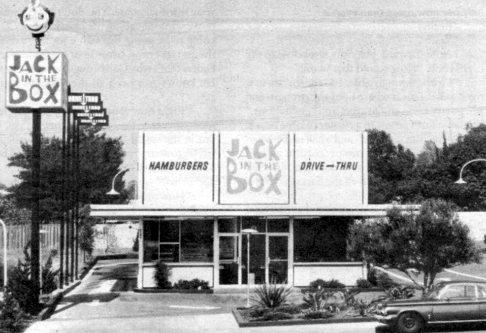
More important, however, than our city’s rather ordinary participation in the Googie era was San Diego’s true claim to drive-through fame: the Jack In The Box.
Jack’s original box was a rogue geometric element in a horizontal landscape dominated by the more organic forms of Googie. It was weirdly honest in its approach to dispensing food, and San Diego’s response was immediate: We loved it.
In search of its origins, I called on architect/artist Russell Forester at his home in La Jolla. Forester did most of the original designs for restaurateur Robert Peterson’s Oscar’s coffee shops in San Diego in the 1950s. Peterson also came to Forester to work on a new concept he’d come up with: a drive-through hamburger stand that sold almost all of its food by handing it directly to motorists through a single window. In an era of increasing mobility and the car seen as the new symbol of personal freedom and expression, why not put food right in the driver’s lap while he or she was still on the go?
Forester’s house is a tall rectangle of glass and plywood hidden from the street by ficus trees. The front walk and drive are made of cobblestone-like concrete squares that appear to have been buried deeply in sand or some other matrix. Tree roots have pushed them up to many different heights, making it necessary to watch your step carefully or risk tripping. Forester met me at the door. He is a solid-looking man, about six foot one and in his early 70s, with a beard and a tiny silver pin in his left earlobe. He wore khaki pants, a muted blue-and-white-striped long-sleeved cotton shirt, and pristine, white New Balance tennis shoes. In the living room, he sat in one of three black leather couches kitty-corner to me and began talking.
“I started doing the Oscar’s designs for Bob Peterson. The first was at Midway and Rosecrans. It was a drive-in with carhops. I did another Oscar’s at the border that had a big red metal sculpture out front.” Approximately 50 feet tall, it looked like an insectoid antenna. “When I proposed the sculpture. Bob Peterson asked, ‘What’s it for?’ ‘To sell hamburgers,’ I said.
“I got the Oscar’s work because I was a friend of an advertising man named Preston Justice. He recommended me to Bob Peterson to do the Pacific Beach Oscar’s. Ultimately I did a little steel building...a Miesian steel-frame glass building.”
Forester was influenced by the Bauhaus style in 1950 while at the Institute of Design in Chicago. Designer Laszlo Moholy-Nagy founded the New Bauhaus school in Chicago in the late 1930s. The school later merged with the Illinois Institute of Technology, where Moholy-Nagy’s fellow Bauhaus expatriate Ludwig Mies van der Rohe presided until 1958. Most modern, skeletal steel-frame buildings trace some design lineage to Mies’s elegant use of welded black steel infilled with panels of glass or tan brick.
When it came time to design a Jack, Forester wasn’t about to abandon his modernist and international-style roots.
“In my mind the building was a machine. It had little to do with architecture. There was a certain amount of equipment, and the room needed to use it. Beyond that nothing was called for. You just dealt with this machine that turned out shakes, burgers, and fries. I think that if they [Peterson and partners] could have figured out a way to eliminate people and have something plunk out when you pushed a button, they would have. The main idea behind Jack was Wham! — there’s the hamburger as soon as you drive up. The names and concepts for these places came initially out of marketing, not design. Jack grew out of the bizarre little clown-like character in the Oscar’s logo.”
Competition for the motorist’s roving (and hungry) eye was fierce in San Diego. Sign ordinances were more lenient or nonexistent in the ’50s, and business owners hoped their signs would stand out from the grandiloquent blather of the street. It was Forester’s idea to “stick the Jack way up in the air on posts.” The two-story building, its top half nothing more than a shell to hide rooftop mechanical systems, also functioned as a tall, four-sided billboard. Planning departments, according to Forester, never really “caught on” to this clever circumvention of billboard laws on city streets.
“There was always a lot of discussion on how to get people to come in. What is the lure? Is it 29 cents? Or that the building looks a certain way? My feeling is that it was a combination. One time, when we were designing an Oscar’s, I proposed that we not have a sign at all. I said, ‘Everything else on the street has a sign, so the only way for us to be different is to just not have one at all!’ ”
Forester takes most pride in the “honesty” of early Jack In The Box designs. “There was nothing fake [in the sense that] we never tried to make it look like brick or somebody’s mansion. It was a billboard. It had a great deal of honesty, and that honesty came from the client, Peterson, who was a purist when it came to design. Today I think that Jack and all the other fast-food restaurants are striving for a look of stability, a sense of belonging, of trying to look legitimate. Instead of looking good, they just look fake.” One exception was Kendrick Bangs Kellogg’s design for a drive-through burger joint that opened last year on Mission Boulevard. Kellogg, well-known for his organic Chart House restaurant designs that made elaborate use of laminated beams and poles, suspended a blue cylinder form in this new building amid a forest of poles and curved beams. The establishment soon closed, however, and was unleased as of press time. Kellogg’s buildings are most effective when given larger sites; they need room to be recognized as buildings rather than elegant jumbles of what look to be driftwood and whale bones.
Many fast-food restaurant chains now use the mansard roof (characterized by two slopes on all four sides of the building) to create a squat, low-key look. This style also hides rooftop machinery.
McDonald’s, once known for its exuberant golden twin parabolas flanking a glass-and-steel pavilion, is now the most boring recitation of mansardism. Only the Wienerschnitzel chain still clings to its defining, red-roofed mini-A frames. Ugly but effective. Rally’s also has a touch of individuality in its tiny drive-through facilities decorated with colorful tile. Local Mexican food chains seem content, for the most part, to dunk their buildings in a taco-sauce uniformity of orange and yellow paint. The fast-food world is one in which the logo is often the only real design element facing the street.
“Perhaps architecture was homogenized when the food all became the same,” lamented Forester. “It’s just part of the homogenization of our country. There was a time when you could be different and it was all right.”
The current advertising campaign for Jack In The Box claims that “Jack Is Back,” but the original Jack, and the experimental, exuberant architectural climate in San Diego that spawned it, appears gone forever.